

Jacob Jan Founder, Scalable
Writes about commerce AI and creative operations.
Listing strategy
8 Amazon listing images, 8 jobs: 1 wins the click, 7 win the sale
The blueprint for what each of your 8 listing images must say, in what order, and why.
TLDR
- You open the photo slots on a new listing and the blank canvas stares back: you know the pictures should sell, but not what each one should say.
- Here is the shift. A listing is not an album of nice photos. It is a sequenced sales pitch.
- 8 images, 8 jobs: 1 wins the click, 7 win the sale, in an order that argues for the buy.
- Plan the stack once and you never guess at a gallery again.
How many images should an Amazon listing have, and what should each one do?
Quick answer
Amazon requires a main image and recommends at least 6 more beyond it [1]. Treat your Amazon listing images as 8 jobs, not 8 photos: 1 attraction image wins the click, and 7 conversion images win the sale by confirming the promise, showing the differentiator, answering objections, and closing. Order them as one argument and the gallery reads as a data-based sales pitch instead of a slideshow.
That reframe is the whole game. The old way treats the gallery as decoration and pours every effort into one hero shot. A converting listing does the opposite: all 8 images are one argument, each with its own job, ordered so the sequence persuades.
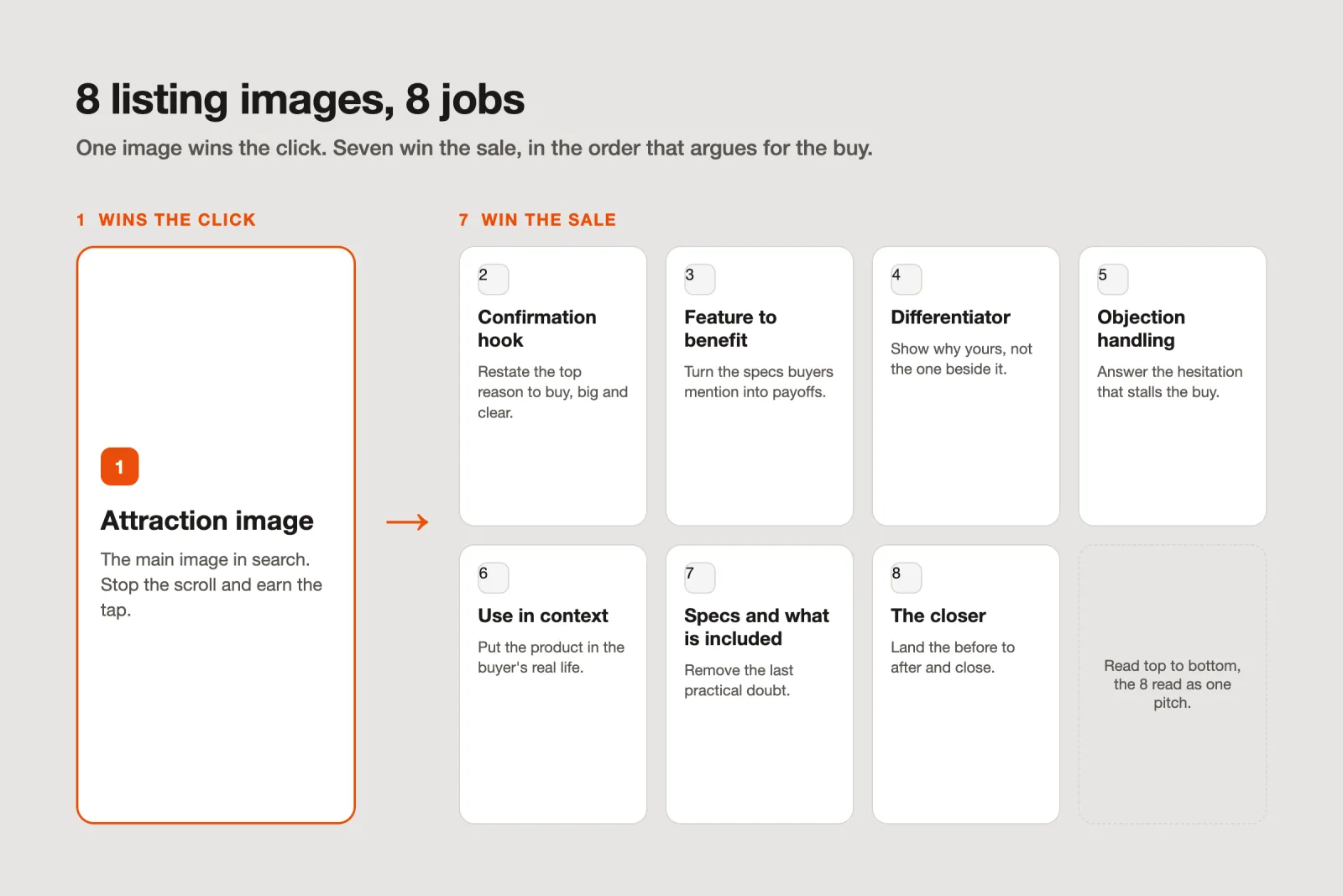
Your listing is a sales pitch, not a photo album
Think about how a shopper reads your listing. They meet one image in search, tap through if it earns the tap, then scroll a gallery on a phone, deciding whether to trust you with their money. That is a pitch with a beginning, middle, and end. A photo album has no argument. A pitch does.
The buyer's brain runs two modes, and your images serve both. One is fast and emotional: it decides in a blink whether to stop scrolling. The other is slower and rational: it hunts for proof, weighs the objections, and justifies the purchase. Beautiful images alone flatter the first mode and starve the second. Strategically built images feed both.
So split the work the way the brain splits it. One image wins the emotional decision to look. The next seven earn the rational decision to buy. That is the 8-slot content strategy in one line, and everything below just names the 8 jobs.
Slot 1: the attraction image that wins the click
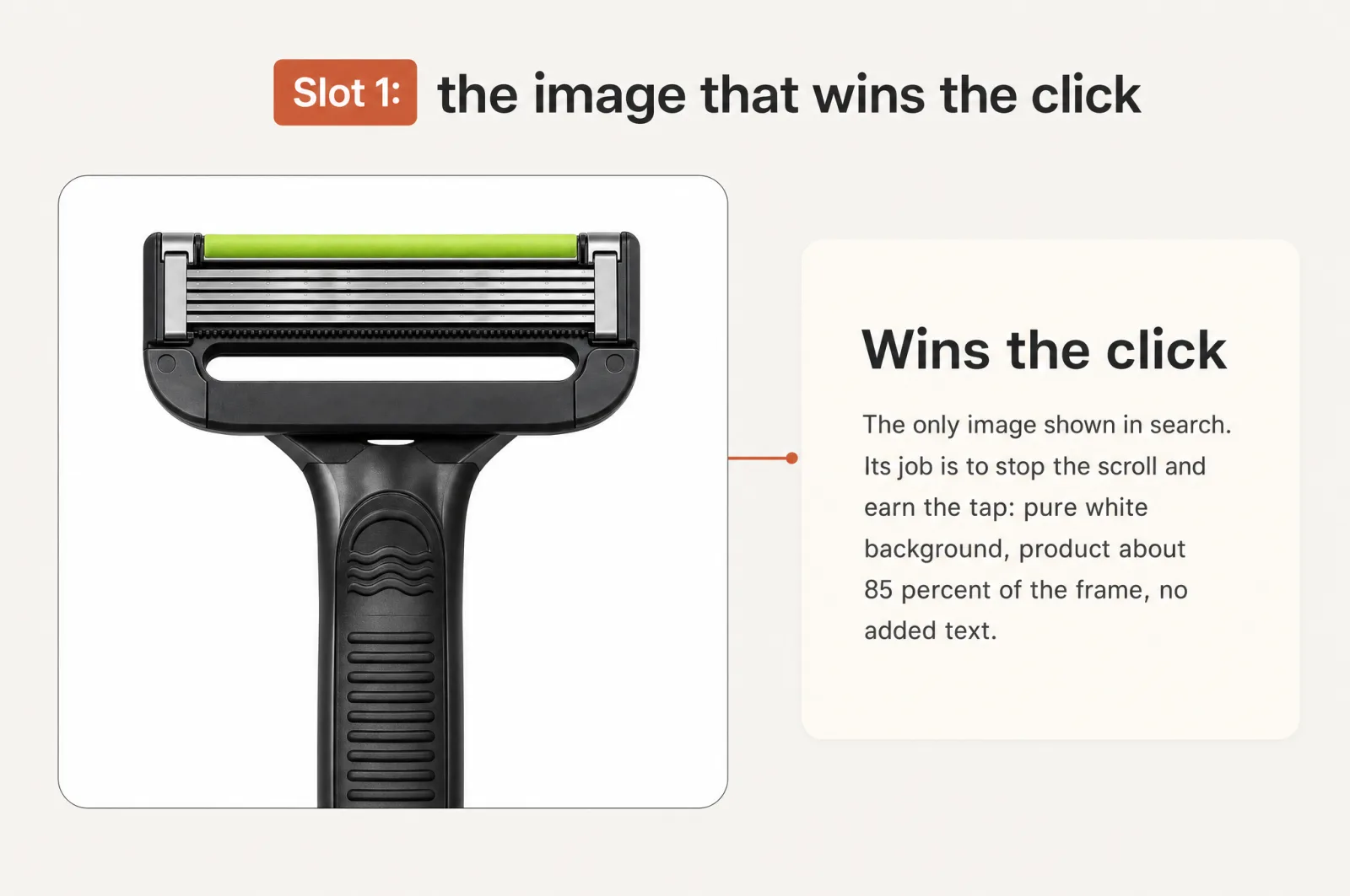
Your main image has one job, and it is not to describe the product. It is to stop the scroll and earn the tap. This is the single biggest lever you have on Amazon, because it is the image shown in search results [1]. No click, and the other 7 images never get seen.
This slot serves the emotional mode. It has to read in a blink at thumbnail size on a crowded results page. Amazon also fences it in: a pure white background (RGB 255, 255, 255), the product filling about 85% of the frame, no added text, props, or logos [1]. Break those rules and the listing can be suppressed from search [1], so the creativity here lives in angle, lighting, and composition, not clutter.
The trap is guessing which approach wins. You do not have to guess. Scalable's main-image hub carries 21 proven click-through strategies and generates them from your product photos in parallel, so you choose the winner from real options instead of betting on one.
Slots 2 to 8: the 7 conversion Amazon listing images that win the sale
Once the shopper taps through, the job changes. Now you are answering the rational mode, and you have 7 slots to do it. This is where the album approach falls apart: it shows more angles of the same product instead of advancing an argument.
Give each slot one job, in order. Each one carries its own on-image copy, and that copy is written in your customers' own words.
| Slot | Its one job | What it says |
|---|---|---|
| 2. Confirmation hook | Confirm the click. Restate the top reason to buy, big and clear. | The single benefit the shopper came for, taken from your top conversion driver. |
| 3. Feature to benefit | Turn the features buyers mention into payoffs. | "Holds 40 oz, so one fill lasts the whole day," not a spec dump. |
| 4. Differentiator | Show why yours, not the one they are also viewing. | The gap your reviews and competitors reveal you own. |
| 5. Objection handling | Answer the hesitation that stalls the buy. | The worry your 1-star reviews keep raising, resolved on the image. |
| 6. Use in context | Put the product in the buyer's real life. | The moment and the feeling, so they picture owning it. |
| 7. Specs and what is included | Remove the last practical doubt. | Size, fit, and what is in the box, so nobody leaves to go ask. |
| 8. The closer | Land the transformation and close with confidence. | The before-to-after your reviews describe, in their language. |
Notice the shape. Confirm, then prove, then handle the doubt, then close. That is a sales conversation, not a gallery, and it is the half of amazon listing optimization the album approach ignores. Most of these are product infographics: a visual carrying one line of copy over the product, doing conversion rate optimization you control without touching your price.
Because over 70% of e-commerce traffic is now mobile [2], every one of these images has to land at thumb size. One idea, few words, big enough to read.
Every slot speaks your customer's language
Here is the part that separates a real blueprint from a prettier photo shoot. The copy on each image is not invented in a brainstorm. It is lifted from what your buyers already told you.
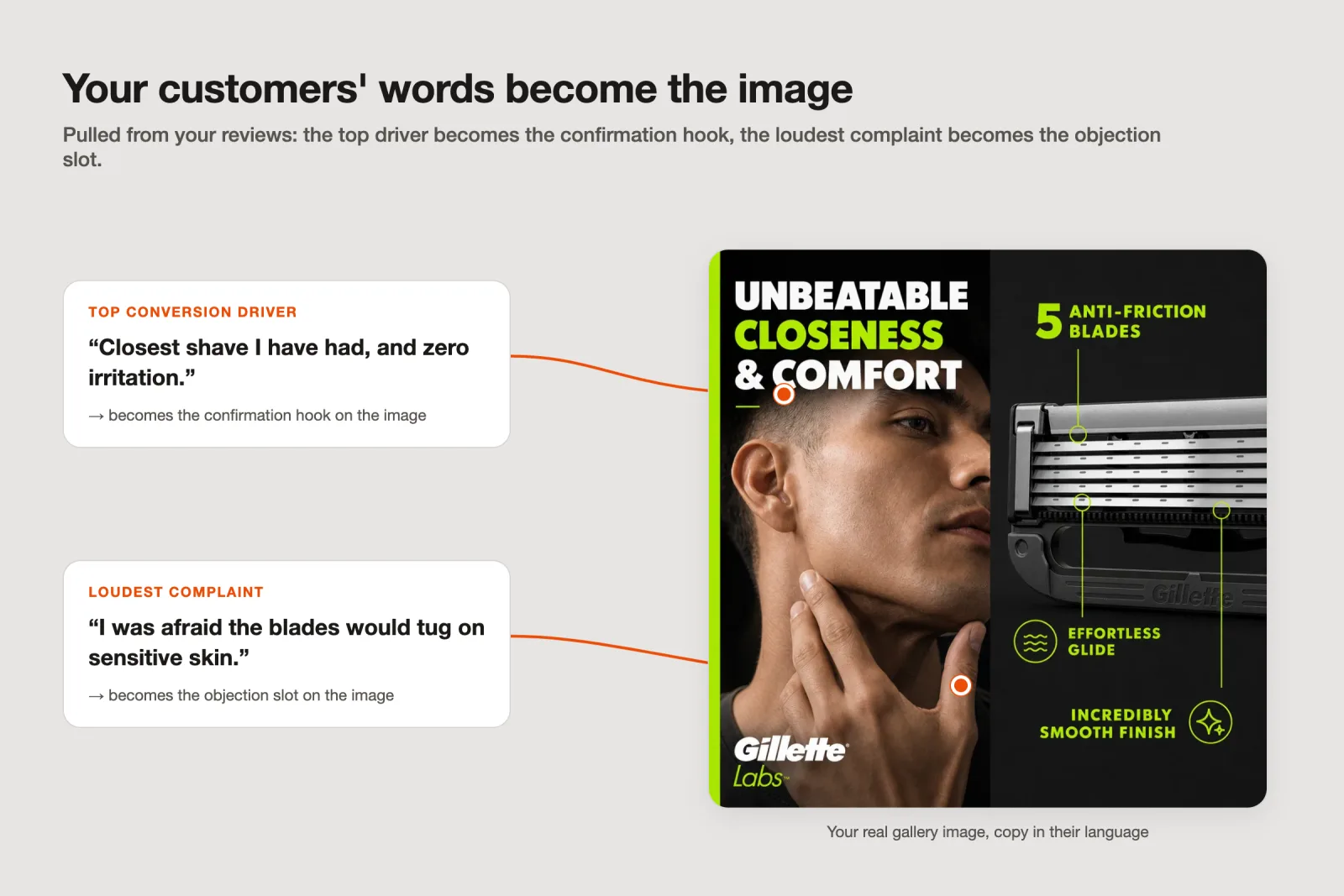
You can do this by hand. Read your reviews and find the phrase that repeats most: that line is your confirmation hook. Find the complaint that repeats most: that is your objection slot. The words your buyers use become the words on the image, so it reads like their own reasoning handed back to them.
Scalable is the fast path. It reads up to 500 of your reviews and ranks the conversion drivers, the things that make people buy, by how often they come up and how strongly. It also finds the communication gaps, the points buyers care about that your listing never shows. Those two lists write your gallery: the top driver becomes the confirmation hook, the loudest gap becomes the objection slot.
This is also how you answer the fair question, "isn't this just making my images look nicer?" No. A pretty image that argues the wrong point still loses the sale. Scalable's image audit scores your current set on both modes at once, the emotional side (visual execution, perceived value) and the logical side (communication strength and clarity), and benchmarks each against the category leaders, so you see which images look good but argue badly before you spend a cent replacing them.
Order is the argument
You could have 8 strong images and still lose, if they land in the wrong order. Sequence is persuasion. The first slot after the main image sets the promise, so it cannot be a spec sheet. The last slot is what the buyer carries to the "add to cart" decision, so it cannot be a size chart. Put the closer in slot 3 and the differentiator at the end, and the pitch stumbles even though every image is fine on its own.
Read top to bottom, the 8 should feel like one digestible case: you came for this, here is proof, here is why us, here is why your worry is handled, here is your life with it, here are the details, here is the confident close. That is what "a data-based sales pitch" means in practice. The 8-slot strategy lays the listing out exactly this way, so you approve an argument, not a pile of assets.
Build all 8, not one hero
The shift is simple to say and it changes everything: stop shipping one hero image and a gallery of afterthoughts. Ship 8 images doing 8 jobs, ordered so the data does the arguing. One image wins the look, 7 win the buy.
You do not need a designer or a week to do it. Add your product, and Scalable turns your own reviews and market data into the full 8-slot stack, on-brand and launch-ready, with the copy already written from your customers' language. It is the same fixed blueprint on every SKU, so a catalog stays consistent as it scales, at a fraction of an agency or an in-house hire. Brands and agencies run 127k+ assets a month this way, and you can build your first stack free. Start at the blank canvas, and walk away with a pitch.
Frequently asked questions
- How many images should an Amazon listing have?
Amazon requires one compliant main image and recommends at least 6 more, for a gallery of several additional images. A strong approach is to plan 8 images with 8 jobs: 1 attraction image to win the click and 7 conversion images to win the sale. Fill the slots you are given rather than leaving a thin gallery that stops arguing halfway.
- What are Amazon's main image requirements?
The main image must sit on a pure white background (RGB 255, 255, 255) and show the product filling about 85% of the frame, with no added text, props, or logos. It is the image shown in search results, so it carries the click. A main image that breaks the rules can get the listing suppressed from search until you fix it.
- What should Amazon gallery images show?
The gallery is where you win the sale. Give each image one job in sequence: confirm the promise the main image made, translate features into benefits, show your differentiator, answer the top objection, place the product in real use, cover specs and what is included, then close. Write the on-image copy in your customers' own words, pulled from your reviews.
- Do Amazon product images affect conversion?
Yes, in two places. The main image drives click-through from search, since it is the thumbnail shoppers see first. The gallery drives conversion once they land, by answering the reasons people buy or hesitate. Weak or random images quietly cap both, which is why a sequenced set beats a pile of pretty photos.
Sources
- 1.Amazon Seller Central: Product image guide
- 2.OuterBox: Mobile eCommerce statistics 2025
- 3.Your listing image looks the part. But does it make its case?
- 4.Stop gambling on your Amazon listing
- 5.Amazon listing optimization: turn 8 images into an ordered sales pitch
- 6.Design for the Amazon thumbnail: listing images that still sell on a phone
Built by someone who’s lived it.
I’ve been in e-commerce since 2018. I built and exited my own brand, then spent 5+ years running a creative agency for product companies, shipping the listings, ads, and content that move real sales.
Filed under
Launch your full Amazon listing in minutes, in-house and on-brand
Main image, gallery, A+, ads, translations and variations. Built on your reviews, optimized for conversion.
Next recommended read
How to make an Amazon main image that wins the click
Your Amazon main image decides the click. Learn what moves CTR, what the rules allow, and how to test a portfolio of proven strategies fast.
8 min read
More on this topic — playbooks and product deep-dives.

Amazon main image requirements: stay compliant and still win the click
The Amazon main image requirements in full, plus how to lift click-through without breaking a rule or getting your listing suppressed.

Your best Amazon gallery images are hiding in your reviews
Amazon listing optimization starts in your reviews: a 4-step method to find conversion drivers, close communication gaps, and build gallery images that sell.

Your listing image looks the part. But does it make its case?
Every Amazon listing image is judged on two axes at once. Run an Amazon listing audit on both before your next reshoot and fix the one costing the sale.