

Jacob Jan Founder, Scalable
Writes about commerce AI and creative operations.
Mobile-first design
Design for the Amazon thumbnail: listing images that still sell on a phone
The desktop preview is a lie. On mobile your image is judged at thumbnail size, so design for the small render and win the glance.
TLDR
- You spent hours on a gallery image that looks sharp on your screen, then it shrinks to a fingernail in the feed and the words turn to mush.
- Most shoppers never see that big view. They judge a tiny Amazon thumbnail on a phone, in about a second, mid-scroll.
- You can design for that small render on purpose, so one clear message survives the shrink.
- Below: what breaks at thumbnail size, 5 rules to fix it, and a 10-sec test before you ship.
How do you make an Amazon listing image readable on mobile?
Quick answer
Design for the Amazon thumbnail, not the desktop preview. Give each image one job and one message. Use a few large, high-contrast words instead of a paragraph. Keep the product big, the layout simple, and callouts away from the edges. Then shrink the picture to thumbnail size and check the message still reads at a glance. If it survives the squint, it will survive the feed.
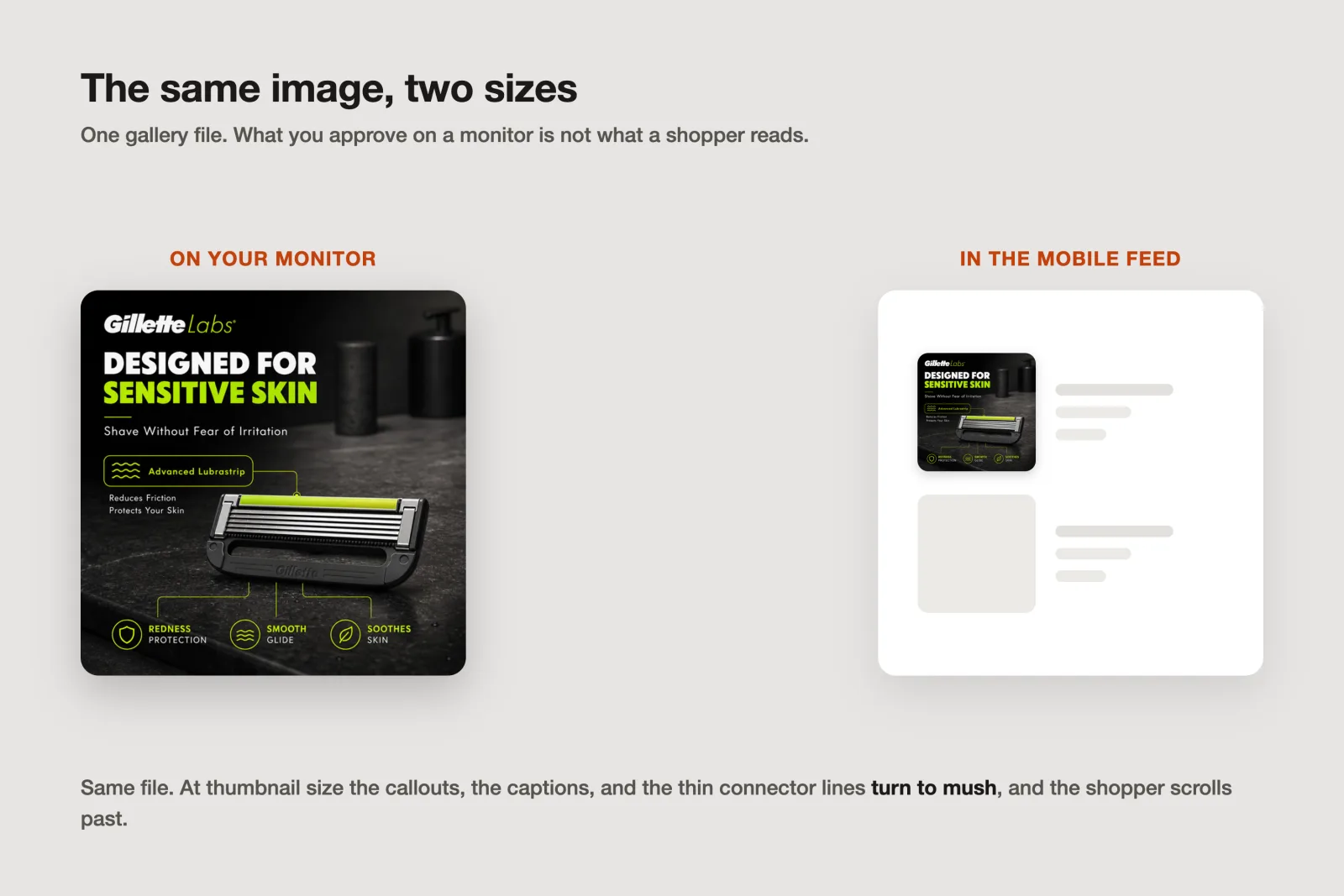
Where buyers meet your listing
Open your best listing image on a laptop and it looks great: big, sharp, every callout readable. Now watch a shopper find it: on a phone, in a scrolling results grid, at roughly the size of a postage stamp. That is the real canvas, where most of the buying happens, and where your Amazon listing images win or lose.
Most Amazon shopping now runs on a phone, and that phone already converts at less than half the desktop rate, with cramped screens a big part of why [1]. So the smaller surface is both the majority and the harder sell. A picture that only works at full size hands that surface a second handicap.
A thumbnail has 3 jobs: earn the tap, look credible, and stay legible. The first two get all the attention, and they earn their own playbooks, like making a main image that wins the click and looking the part before you make your case. Legibility, the third job, is the one quietly failing on mobile, and it is the whole focus here.
The fix is not a better photo. It is a change of default: build for the small render first, then let it scale up. The desktop preview flatters you; the thumbnail tells the truth.
What your Amazon thumbnail has to survive
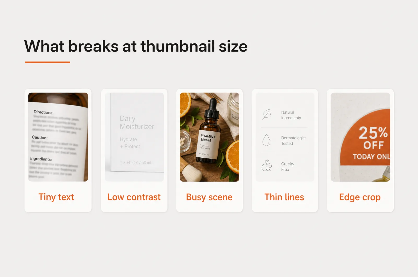
Shrink a picture and it does not fail gracefully. Detail collapses in predictable ways, and once you know the 5, you can catch them before you upload.
Tiny text. A stack of benefits that reads fine on a monitor becomes a gray smudge at thumbnail size. Shoppers do not read these images anyway. They scan them in a blink, so buried words are gone before anyone reaches them.
Low contrast. Light gray on white, or thin type laid over a busy photo, needs pixels you no longer have. Drop the contrast and the message dissolves into its background.
Busy scenes. A big screen can hold 6 competing elements; a small one turns them into noise. With no clear focal point, the eye lands nowhere and the shopper scrolls on.
Thin lines and small icons. Delicate strokes, 1px borders, and detailed iconography vanish first. What looks elegant at full size becomes nothing once it is shrunk.
Edge-cropped callouts. A claim pushed to the border gets clipped by the feed's rounded corners and tight crops, so your key line loses its first or last word.
None of these are photography problems. They are hierarchy problems, and hierarchy is the part you fully control.
Design for the thumbnail: 5 rules
Most gallery frames are product infographics: a claim, an icon, a bit of proof. Here are 5 rules for building one that reads at thumbnail size.
1. One idea per image. Pick the single thing this frame must say, and cut everything not carrying it. A picture that argues one point lands; a picture that argues 5 lands none. It is also why each gallery image should own one job instead of repeating the whole pitch.
2. Make the words big and few. One headline of 3 to 6 words, set large enough to read shrunk, beats a paragraph that only works zoomed in. If a shopper cannot catch the line in a glance, it is not doing its job, it is just decoration.
3. Push contrast harder than feels comfortable. On a small, glare-lit screen, subtle is invisible. Dark text on a light block, or light text on a solid dark panel, survives where gray-on-gray dies. Put type on a clean field, never floating over a detailed photo.
4. Scale up, and leave a margin. Make the product and the key claim larger than looks right at desktop size, because you are designing for the shrink. Keep text and badges well inside the frame so nothing important gets clipped at the edges.
5. Group and simplify. Tie related elements together, an icon with its label, a claim with its proof, so the eye reads clusters, not clutter. Fewer, larger, grouped elements always win the scan. If you are unsure, remove one thing and check whether the point got clearer.
A fast gut check for all 5: Scalable's image audit scores every current image on communication clarity, how cleanly one message comes through. If your live images score low there, the thumbnail is where they are losing.
A before and after, in words
Picture a magnesium sleep supplement. The first gallery image is desktop-first: a dim lifestyle photo of a nightstand, 4 thin icons across the bottom, a light-gray sentence about "clinically studied ingredients for restful, uninterrupted sleep," a small certification badge tucked in the corner, and the product half in shadow.
At full size it looks thorough. At thumbnail size it is a murky rectangle with no message at all.
Now the rebuild. One job: this helps you fall asleep. The bottle is large and lit against a deep, calm navy panel.
Top-left, 3 bold words read "Fall asleep faster," in high-contrast white. One icon, one short label, grouped underneath. The badge moves inward and shrinks to a single trust cue.
Same product, same claim, same brand. The second version holds up shrunk, so the shopper gets the point in the half-second you have. Nothing was added; plenty was removed.
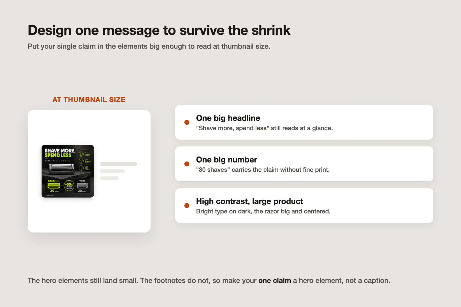
The squint test: check before you ship
Here is the 10-sec habit that catches almost everything. Shrink the finished image to the Amazon image size shoppers see in the grid, not the full-resolution file you uploaded, then hold your phone at arm's length and glance for 1 sec. Ask one question: did the single message land?
If you caught the point, ship it. If you had to lean in, hunt for the words, or squint to read the callout, the image is not done, and no shopper will do that work for you. Shrinking your own image feels almost too small to matter, and almost nobody does it, which makes it close to free advantage and the cheapest quality gate you have.
Build images that read small
You already do the hard part: the product, the brand, the real claims from your reviews. The last step is making sure they survive the shrink. Scalable builds each listing image against a data-driven strategy, one job per frame, with type locked to your brand kit for a consistent, premium look, and it can sharpen mushy AI text without regenerating the whole image.
It is one piece of your Amazon listing optimization, and the piece mobile punishes hardest. Start free, generate a gallery image, and run it through the squint test. If the message still lands at thumbnail size, so will the sale.
Frequently asked questions
- What size do Amazon product images show at on mobile?
In the mobile search grid and the gallery strip, your image displays far smaller than the full-size version a shopper can tap to zoom. Treat the small grid view as the real first impression: people decide whether to tap based on the shrunk version, so your one message has to read clearly before any zoom happens.
- Why do my Amazon images look cluttered or blurry on a phone?
Usually because they were designed on a big screen. Fine print, thin lines, low-contrast text, and 6 competing elements all look fine at full size and collapse at thumbnail size. Blurry lettering is often AI-rendered type that was never sharpened. Design with one focal point, a few large high-contrast words, and check it shrunk before you ship.
- How many words should an Amazon gallery image have?
As few as carry the point. One headline of 3 to 6 words that reads at thumbnail size beats a paragraph that only works zoomed in. Give each image one job and one message, keep the rest in your bullet points and description, and let the picture make a single claim a scrolling shopper absorbs in about a second.
Sources
Built by someone who’s lived it.
I’ve been in e-commerce since 2018. I built and exited my own brand, then spent 5+ years running a creative agency for product companies, shipping the listings, ads, and content that move real sales.
Filed under
Launch your full Amazon listing in minutes, in-house and on-brand
Main image, gallery, A+, ads, translations and variations. Built on your reviews, optimized for conversion.
Next recommended read
How to make an Amazon main image that wins the click
Your Amazon main image decides the click. Learn what moves CTR, what the rules allow, and how to test a portfolio of proven strategies fast.
8 min read
More on this topic — playbooks and product deep-dives.

Your listing image looks the part. But does it make its case?
Every Amazon listing image is judged on two axes at once. Run an Amazon listing audit on both before your next reshoot and fix the one costing the sale.

8 Amazon listing images, 8 jobs: 1 wins the click, 7 win the sale
Your Amazon listing is not one hero image. It is 8 Amazon listing images doing 8 jobs: 1 wins the click, 7 win the sale. Here is the blueprint.

The Q4 catalog refresh: Amazon listing optimization for peak season without a photoshoot
Amazon listing optimization for Q4: refresh every listing for Prime Day and BFCM without a photoshoot. What to change, what to leave, and a dated plan.