

Jacob Jan Founder, Scalable
Writes about commerce AI and creative operations.
Listing optimization
Your best Amazon gallery images are hiding in your reviews
Amazon listing optimization starts with what your buyers already told you. Here is how to turn reviews into gallery images that convert.
TLDR
- You are guessing which images will sell your product, and guessing is expensive: you pay for new creative and still cannot tell if it moved a single sale.
- You do not have to guess. Your customers already wrote the answer in your reviews, in the exact words that made them buy or hesitate.
- This is a 4-step method to read those reviews, find what your images fail to say, and rebuild your gallery so each frame answers a real question.
- Do it once by hand and you will feel the difference. Then let a tool run the whole loop from a single product.
The first thing most shoppers do on a product page is skip your text and start swiping through the images [1]. Those few frames carry the sale. So the biggest move in Amazon listing optimization is not writing a cleverer bullet point. It is making your Amazon listing images say the right things.
Here is the trap. Most sellers pick what goes on those frames from taste, a competitor's layout, or a designer's best guess. That is a bet placed blind, and you find out whether it worked only after the money and the weeks are gone.
You never needed to guess. The people who bought your product told you what convinced them, and the people who hesitated told you what almost stopped them. It is all sitting in your reviews.
Your reviews already contain your best gallery images
A product with 5 reviews is 270% more likely to sell than one with none [2]. Reviews move buyers because they are the one place a shopper hears the truth from someone with nothing to sell. That honesty makes them the richest brief you will ever get for your images.
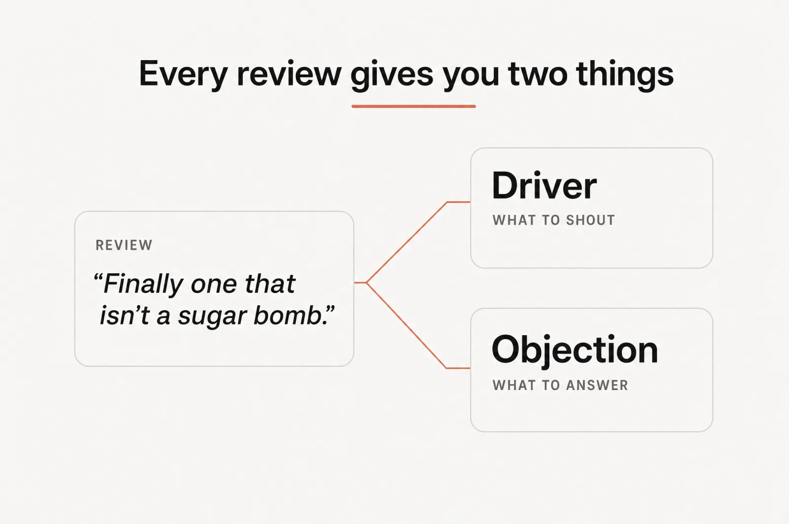
Read closely and every review hands you one of two things:
- A conversion driver. The reason someone bought: the feature, outcome, or relief that tipped them over. This is what to shout.
- An objection. The doubt someone raised before or after buying: the fear, question, or comparison they wrestled with. This is what to answer.
Definition
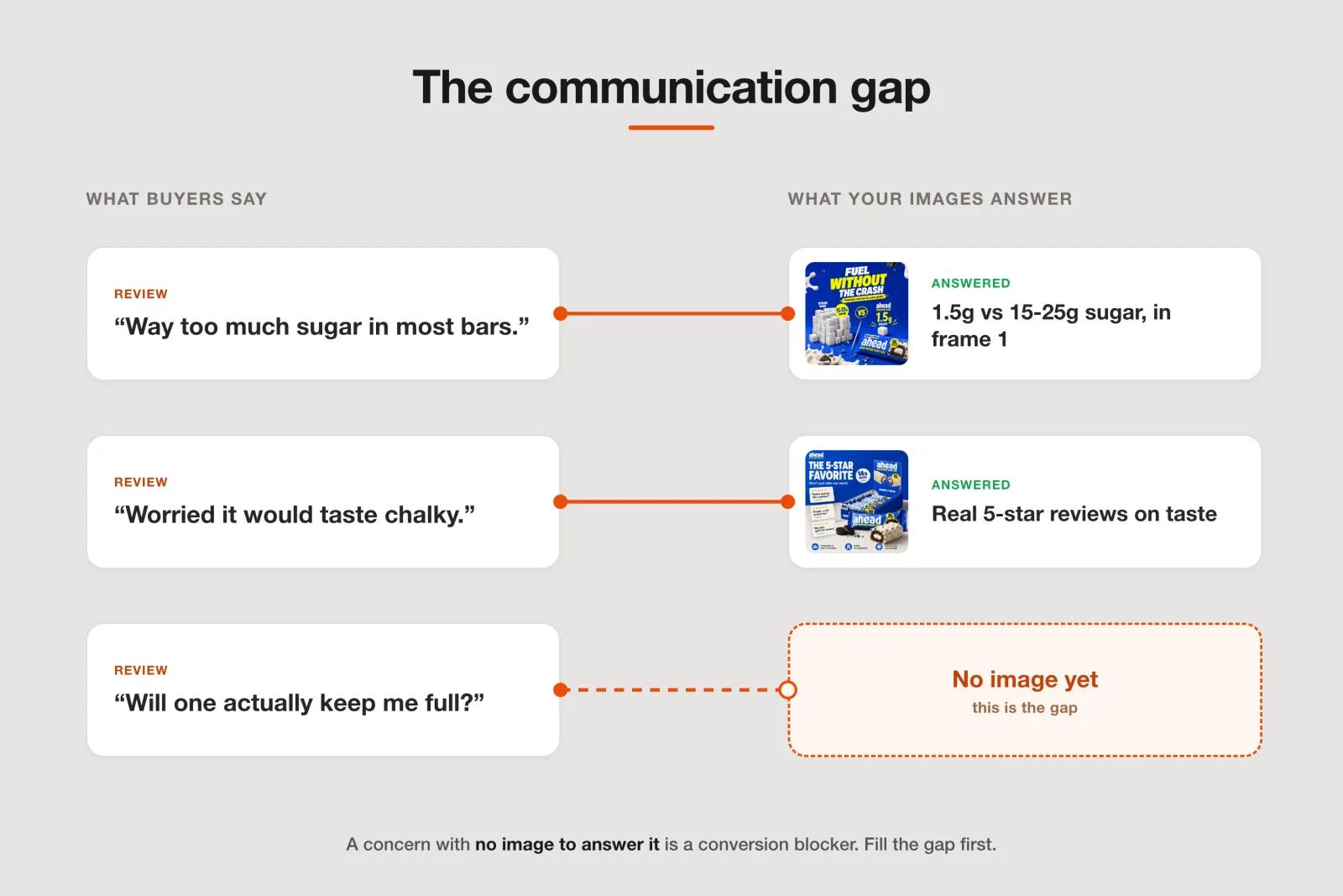
Communication gap: the distance between what buyers care about (your reviews) and what your listing actually shows (your images). Every gap is a blocker, a question the shopper carries to checkout unanswered.
Closing those gaps is the heart of ecommerce conversion optimization, and Amazon gives you the room to do it. It requires one compliant main image and recommends at least 6 more, plus a video [3].
That is a stack of slots you can aim at real objections. Most listings spend them on repeat product shots. Yours can answer a different fear in every frame.
Step 1: read your reviews for buying signals, not stars
Star ratings tell you if people are happy. They do not tell you why people buy. Those are different questions, and only the second one builds a converting image.
Good amazon review analysis means going through your reviews, and your top competitors' reviews, since their buyers are your buyers, and tagging two lists:
- Drivers: the phrases that explain a purchase. "Finally one that keeps my coffee hot." "The only bar my kid will eat." "Fits my car cup holder, which none of the others did."
- Objections: the phrases that show hesitation. "Worried it would taste chalky." "Wasn't sure how much sugar was in it." "Reviews said the last brand leaked."
Capture the literal wording. A shopper trusts "tastes exactly like cookies" far more than your polished "great flavor profile." The buyer's own language is the copy you want on the image, because it reads as true.
Now rank each list by how often a theme repeats. Frequency is a vote. Ten reviewers raving about the same thing is a driver worth a whole frame. Ten reviewers naming the same worry is an objection quietly costing you sales.
Step 2: find your communication gap
You have two lists now: what buyers care about, and what your current images show. Lay them side by side. The mismatches are your communication gaps, and they are the most actionable part of this whole exercise, because closing a gap has a straight line to conversion.
Audit each current image on two questions, because a shopper decides with two different parts of the brain:
- Does it look the part? Visual execution and perceived value. A cheap-looking frame makes a good product feel risky.
- Does it make the argument? Communication clarity. A premium-looking image that says nothing still loses the sale.
A listing can pass one test and fail the other. Beautiful images that argue nothing are the most common miss. So is a strong claim buried in a frame too ugly to trust. Score every image on both, mark which of your ranked drivers and objections it addresses, and the holes light up on their own.
Step 3: rank the gaps so you fix what matters
Not every gap is worth an image. You have limited slots and limited time, so spend both where they move the most buyers.
Score each gap on two things:
- Frequency: how many reviewers raised it. A worry named once is noise; a worry named 40 times is a wall.
- Impact: how likely it is to stop a purchase. A pricing doubt or a safety fear outranks a minor preference.
Frequency times impact gives you an order. Fix the top gaps first. Often 3 or 4 images carry almost all the lift, because they answer the doubts that were quietly turning buyers away at scale.
Step 4: turn each gap into an image that answers it
Now the build. The rule is simple: one image, one job. Each frame takes one driver or one objection and answers it in the buyer's own words.
A converting frame has three parts: the claim in your customer's language, a visual that proves it at a glance, and one number that makes it concrete. "Fuel without the crash," a photo contrasting two piles of sugar, and "1.5g vs 15-25g" beats any amount of pretty. Sequence the frames the way a good salesperson would: confirm the main promise, show what makes you different, kill the biggest objections, then close.
Watch it work on a real listing. Take ahead, a cookies-and-cream protein bar. Its reviews carry every worry a protein-bar shopper has, and the gallery answers them one by one.
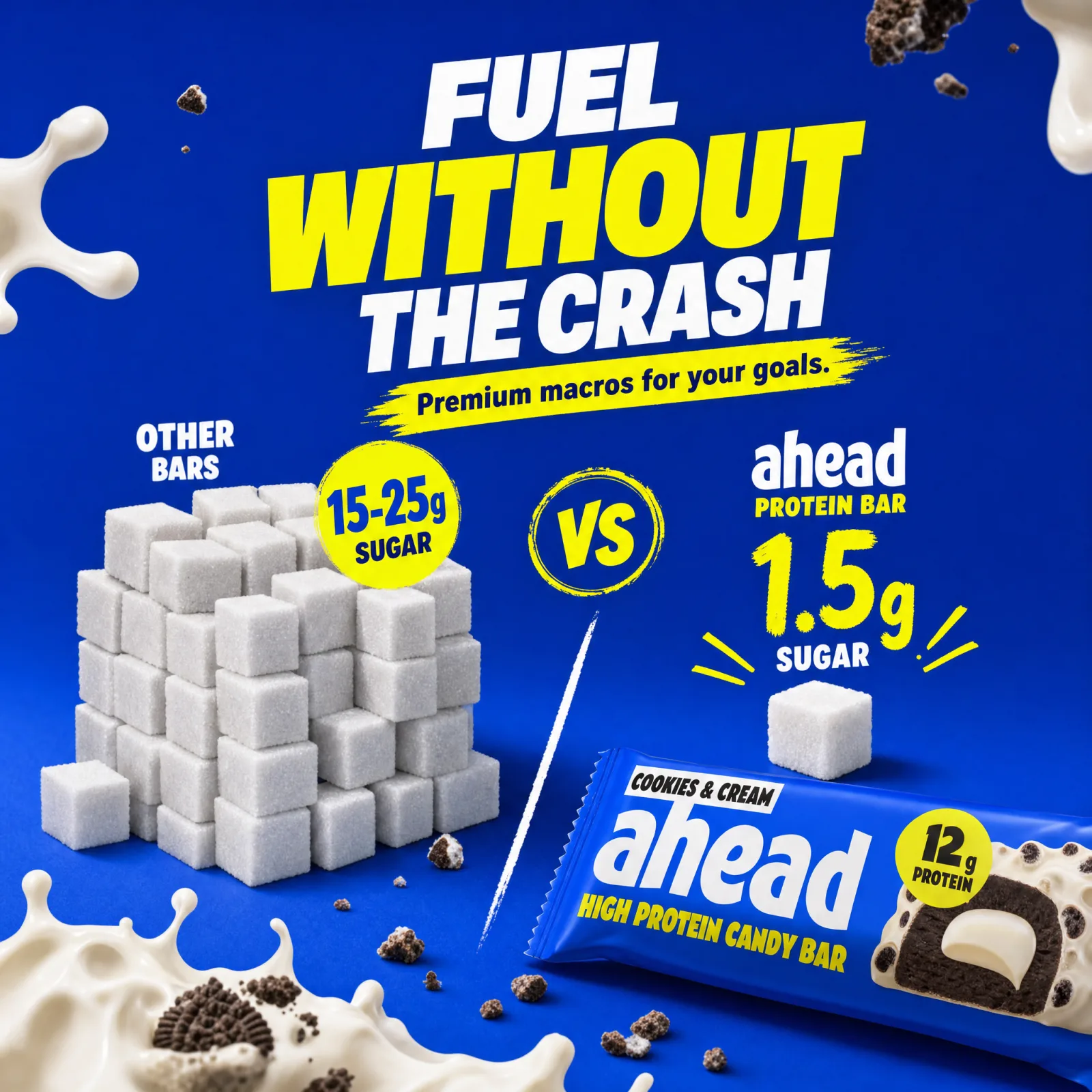
- "Protein bars are sugar bombs that crash me." The gallery leads with a sugar comparison: 1.5g versus the 15-25g in rival bars, under the line "fuel without the crash." The single biggest objection, answered in the first frame.
- "What is actually in it?" The next image is "clean ingredients only": real cocoa butter, no palm oil, made in Germany. It turns a vague worry into a list of reasons to trust.
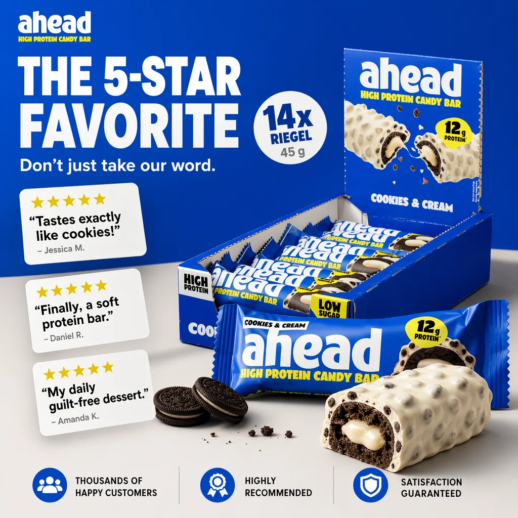
- "Do protein bars taste chalky?" This is the fear no spec sheet can beat, so the listing does not try. It shows real review cards: "tastes exactly like cookies," "finally, a soft protein bar." The objection is answered by the very people who had it.
Notice what did not happen. Nobody sat in a design tool guessing at a theme. Every frame traces back to a line a customer wrote.
That is what makes a gallery convert: not that it is prettier, but that it is relevant to the exact decision the next shopper is about to make. That is also why a plain product infographic built from a real objection outperforms a gorgeous one built from a hunch.
The catch: doing this by hand takes weeks
You can absolutely do this yourself, and it works. It is also a lot of work. Reading hundreds of reviews, tagging drivers and objections, auditing every image on two axes, ranking the gaps, then briefing and revising a designer per frame is a week of focused effort for a single listing. Do it across a catalog and it never ends.
Even after all that, the execution still comes down to a designer's guess about what "clean ingredients" should look like. That is the real villain: not your images, but the slow, manual, guess-at-the-end process standing between you and a listing built on evidence.
How Scalable does the whole loop for you
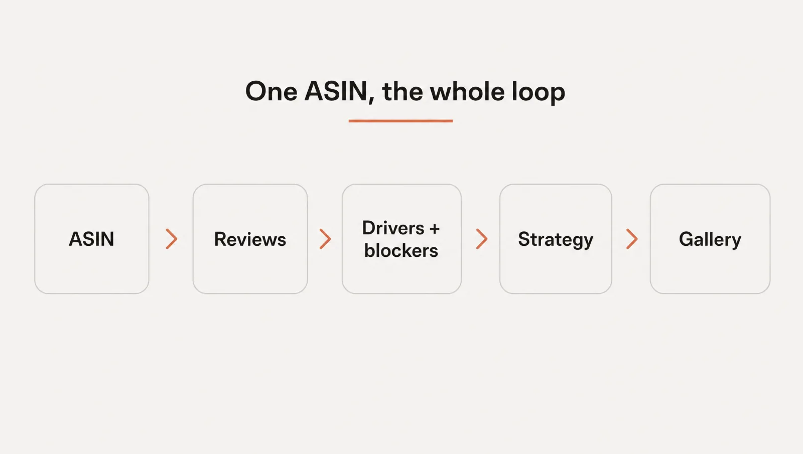
Scalable runs every step above automatically, from one product. You paste an ASIN. It reads the listing and up to 500 reviews, then does the work you just did by hand, only faster and without the guessing.
- It reads the reviews. Review analysis ranks your conversion drivers and, more importantly, your conversion blockers: the things buyers care about that your listing never shows. This is the same communication gap, found for you and ranked by how much it matters.
- It audits your current images. The image audit scores each one on both brains, visual execution and communication clarity, and benchmarks them against the category leaders. "Good" gets set by your market, not by flattery. It is the kind of audit you can stand behind, hand a client, or take to your team.
- It shows the upside. You see where the listing stands, where it could be, and an estimated conversion uplift for closing the gaps, so "will this actually convert?" gets a number instead of a shrug.
- It builds the strategy. You get an 8-slot listing plan: 1 image to win the click, 7 to win the sale, each with on-image copy drawn from your customers' own words. No blank canvas, no prompt to write.
- It generates the frames. Launch-ready gallery visuals, on brand through your brand kit, built inside Amazon's rules by default, in minutes. The ahead images above were made exactly this way.
This is what "content built on data, not prompts" means in practice. Not a generic image tool you have to art-direct, but ai product photography that turns your own reviews into a listing that answers them. Sellers and agencies have generated over 127k assets a month this way, across more than 7,500 brands, for one reason: creative built on evidence outsells creative built on taste.
Start with your own listing
Stop betting on what might convert. Your buyers already told you, in the reviews you have. Read them for drivers and objections, find the gaps between what they care about and what your images show, and answer the biggest gaps first. That alone will lift a tired listing.
Or point Scalable at one of your products and watch the whole loop run in minutes. Your first product and brand kit are free, and you own everything it makes. Run the analysis on your listing.
Frequently asked questions
- How do I use Amazon reviews to improve my listing images?
Read your reviews for buying signals, not star ratings. Pull the reasons people bought (your conversion drivers) and the doubts they raised before buying (your objections). Then check each current image against that list. Every driver or objection your images do not address is a gap, and each gap becomes a new gallery image that answers it in the buyer's own words.
- What is a communication gap in an Amazon listing?
A communication gap is the distance between what buyers care about and what your listing actually shows. Your reviews reveal what shoppers weigh most when deciding. Your images reveal what you chose to say. Where those two lists disagree, you have a blocker: a question or fear the shopper carries to checkout unanswered. Closing those gaps is the fastest way to lift conversion.
- How many images should an Amazon listing have?
Use every slot you are given. Amazon requires one compliant main image and recommends at least 6 additional images plus a video, so a full listing can carry a main image and several gallery images. Treat each one as a job: win the click with the main image, then use the gallery to answer your buyers' biggest questions and objections in order.
Sources
- 1.Baymard Institute: Ensure Sufficient Image Resolution and Zoom
- 2.Spiegel Research Center, Northwestern University: How Online Reviews Influence Sales
- 3.Amazon Seller Central: Product image guide (G1881)
- 4.Amazon main image requirements: stay compliant and still win the click
- 5.How to make an Amazon main image that wins the click
- 6.Your listing image looks the part. But does it make its case?
- 7.8 Amazon listing images, 8 jobs: 1 wins the click, 7 win the sale
- 8.Stop gambling on your Amazon listing
- 9.Amazon listing optimization: turn 8 images into an ordered sales pitch
Built by someone who’s lived it.
I’ve been in e-commerce since 2018. I built and exited my own brand, then spent 5+ years running a creative agency for product companies, shipping the listings, ads, and content that move real sales.
Filed under
Launch your full Amazon listing in minutes, in-house and on-brand
Main image, gallery, A+, ads, translations and variations. Built on your reviews, optimized for conversion.
Next recommended read
How to make an Amazon main image that wins the click
Your Amazon main image decides the click. Learn what moves CTR, what the rules allow, and how to test a portfolio of proven strategies fast.
8 min read
More on this topic — playbooks and product deep-dives.

Amazon main image requirements: stay compliant and still win the click
The Amazon main image requirements in full, plus how to lift click-through without breaking a rule or getting your listing suppressed.

Your listing image looks the part. But does it make its case?
Every Amazon listing image is judged on two axes at once. Run an Amazon listing audit on both before your next reshoot and fix the one costing the sale.

8 Amazon listing images, 8 jobs: 1 wins the click, 7 win the sale
Your Amazon listing is not one hero image. It is 8 Amazon listing images doing 8 jobs: 1 wins the click, 7 win the sale. Here is the blueprint.