

Jacob Jan Founder, Scalable
Writes about commerce AI and creative operations.
Conversion optimization
How to make an Amazon main image that wins the click
The main image is the single biggest lever on your click-through rate. Here is how to build one that earns the click and sells more.
TLDR
- Shoppers decide in about a second whether to click your product or scroll past, and that call rests on one image.
- A prettier photo is not the fix. The image has to answer "why this one?" at a glance, and most never do.
- You do not need a designer or a lucky guess. The levers that move clicks are known, and you can test them.
- This guide covers what moves click-through, what Amazon's rules allow, and how to try several proven approaches fast.
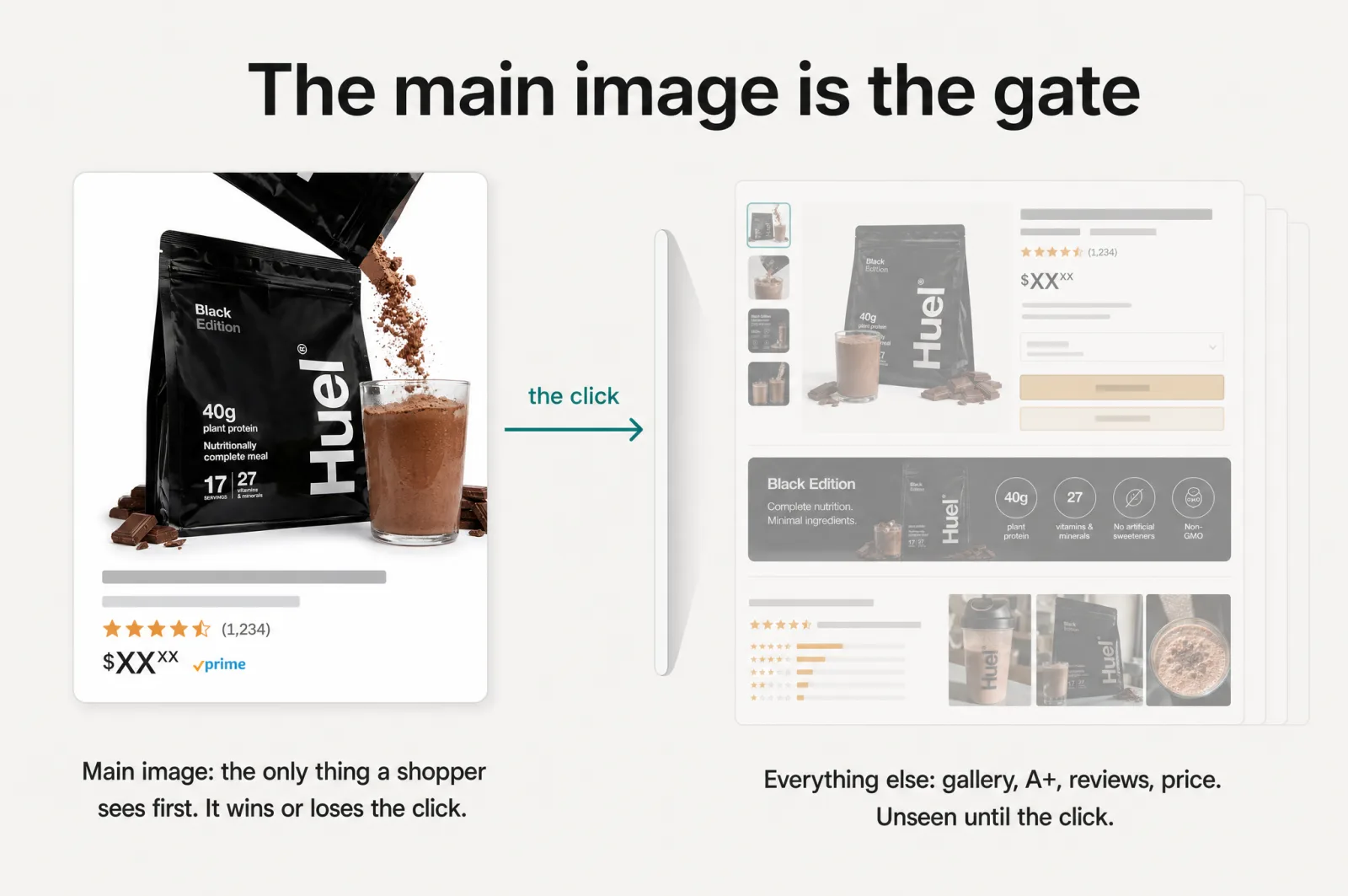
Every shopper who finds you on Amazon sees the same thing first: your main image, shrunk to a thumbnail in a grid of competitors. Before they read your title, your price, or a single review, they have already decided whether to click. That decision is fast, visual, and driven by one picture.
Most sellers treat the main image as a photography problem. Make it sharper, make it brighter, make it prettier. That instinct is why so many listings look fine and still lose the click. A polished picture that says nothing is invisible in a grid. The real job of the Amazon main image is not to look good. It is to answer, in the half-second a shopper gives it, why yours is the one worth tapping.
What makes an Amazon main image get more clicks?
Quick answer
Your main image earns clicks when it communicates the one thing shoppers in your niche care about at a glance, not when it just looks polished. That comes down to the right hero angle, crop, and framing, a clear sense of scale, and contrast that stands out in search. Amazon requires a product-only image on a pure white background, so the strategy lives in how you show the product, not in text or badges added on top.
The gap between a good-looking image and a high-clicking one is strategy: knowing what makes a shopper in your category choose, then building the picture around that. It is a decision you can reason about and test, where taste cannot.
Why your main image is the highest-leverage pixel on the page
Think about where the main image sits in the funnel. It is the gate. If the thumbnail does not earn the click, nothing else on your listing gets a chance: not your gallery, not your A+ content, not your reviews, not your price. All of that work sits behind a door this one picture has to open.
That position is what makes it your highest-leverage asset. A lift here multiplies across every shopper who sees you in search. The math is blunt. For example, at the same traffic, a 20% lift in click-through means roughly 20% more people on your listing, which flows straight into more sales before you spend another cent on ads. You convert more of the visibility you already pay for, instead of buying more.
Scale is where this compounds. If you run dozens or hundreds of SKUs, a repeatable way to get the first image right on every one is leverage that a single freelancer render cannot match. Most sellers pour energy into the gallery and the copy, which matter but sit behind the gate. Winning the first image is the highest-return move in Amazon listing optimization.
First, the rules: what Amazon allows on the main image
Before strategy, constraints. Amazon is strict about the main image, and breaking the rules risks having your listing quietly suppressed in search. The requirements are specific [1]:
Watch out
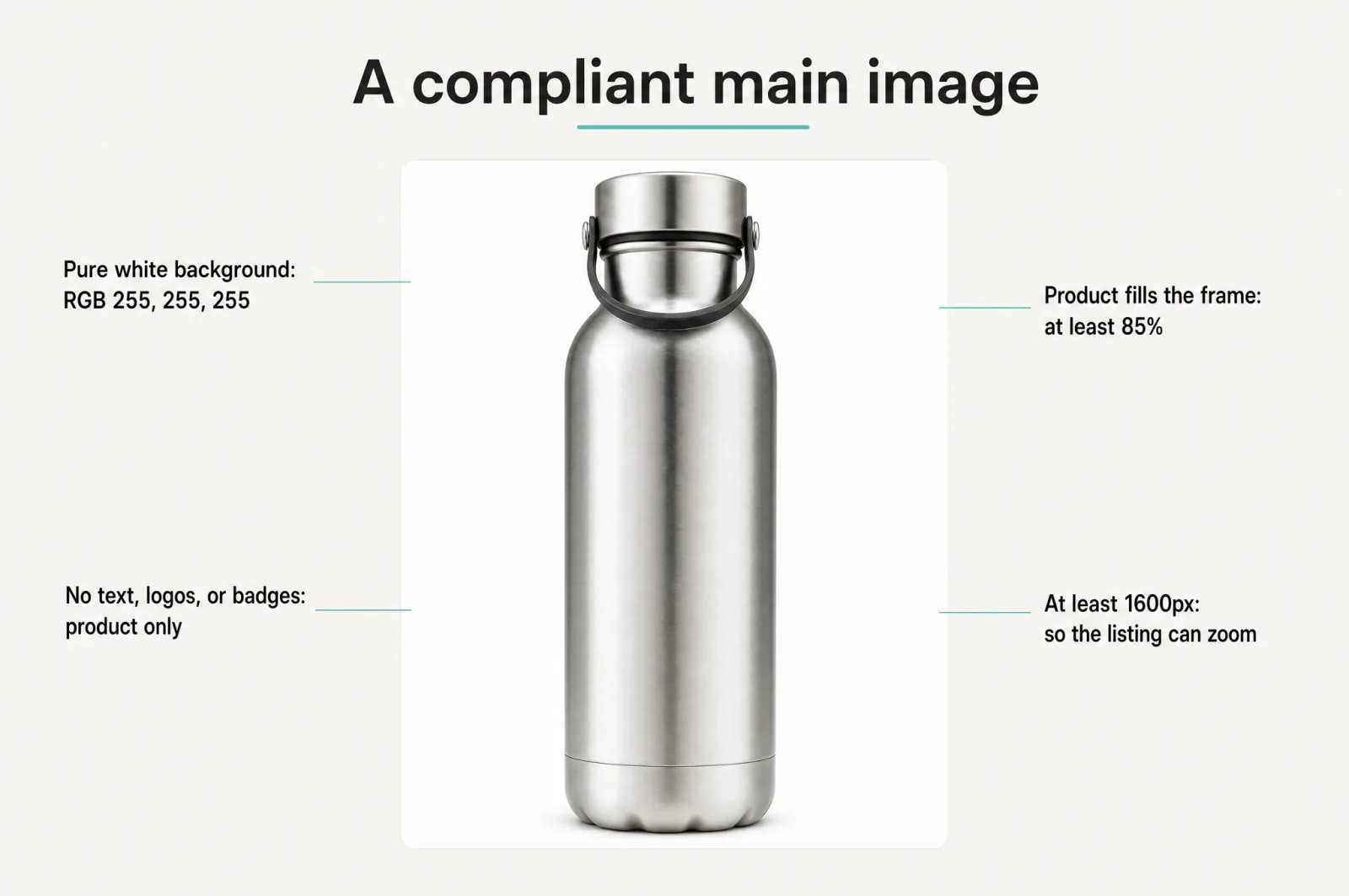
The main image must show only the product for sale, on a pure white background (RGB 255, 255, 255). The product must fill at least 85% of the frame. No text, logos, badges, borders, color blocks, watermarks, props, or other graphics are allowed on the product or in the background.
One more rule covers image size: make the file at least 1600px on its longest side, which is what qualifies your listing for zoom [2]. Shoppers zoom in to inspect detail before they buy, so a small or soft image costs you twice.
This is where a lot of "main image hacks" fall apart. The badge-and-callout tricks you see in guides are often against the rules for the main slot. They are not useless. They just belong somewhere else, which we will get to.
Beautiful doesn't convert. Strategic does.
Here is the belief worth changing: a gorgeous image is table stakes, not an advantage. Everyone's photos are decent now. When every thumbnail in the grid looks polished, polish stops setting you apart, and the click goes to the one that communicates something the others do not.
A strategic main image answers a question the shopper is already asking. Is it big enough? Is it the good version? Is this the whole set or just one piece? Will it fit my life? The winning image picks the one question that decides the click in your category and builds the frame around answering it. That comes from knowing your buyer, and the best source for that sits in your own reviews and your competitors' reviews, where shoppers say in plain words what made them choose or regret. Build around that signal, not a mood board.
The strategies that move click-through
There is a known playbook of main-image approaches that lift the click. The important part is which ones stay inside Amazon's product-only rule and which ones belong on your gallery instead. Both are useful. Using them in the wrong slot is what gets listings suppressed.
Strategies that stay inside Amazon's rules
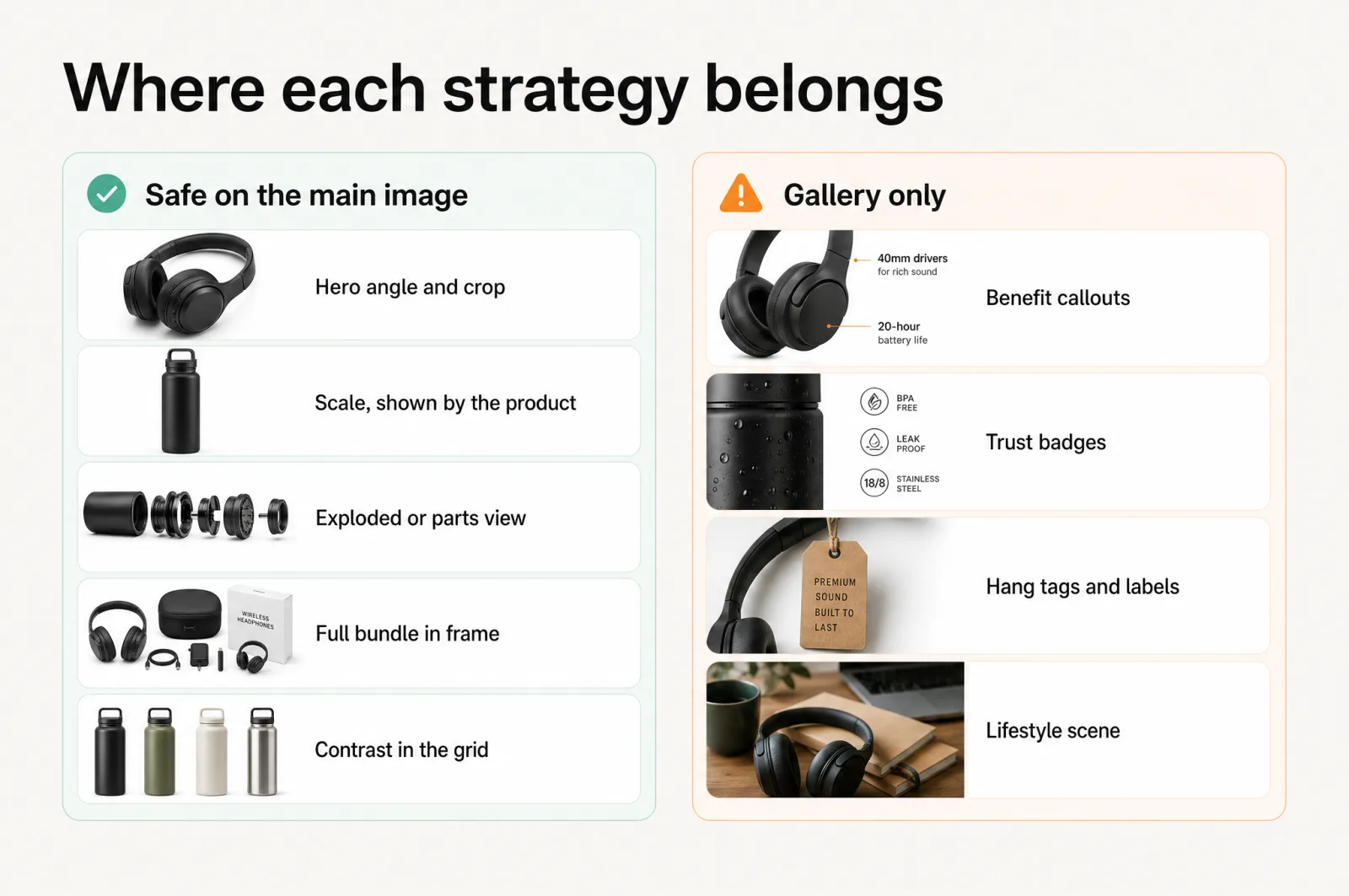
These keep the image product-only on white, so they are safe for the main slot:
- Hero angle, crop, and fill. The single highest-impact lever. Shoot the product at its most flattering, recognizable angle and crop it to fill the frame so it reads at thumbnail size. Most listings waste half the frame on empty white.
- Scale and size, shown by the product itself. If size is a buying factor, show it through the product's own proportions and configuration, not a "16 oz" callout. Let the shape do the talking.
- Exploded or parts view. When you sell a set, showing every included part in one clean arrangement answers "is this the whole thing?" before a shopper even clicks. Everything shown has to be what they receive.
- Full bundle in frame. For multipacks and kits, showing the full quantity signals value fast. Show 2 units and they read very differently from 1.
- Contrast that pops in the grid. The product itself can be staged and lit to stand out against the sea of near-white thumbnails around it, without adding a single graphic.
Strategies that belong on your gallery
These lift the click and the sale too, but they add text, badges, or scenes, so they go on your secondary images, not the main one:
- Benefit-first callouts. Short on-image copy that names the top benefit. Powerful, and against the rules for the main slot.
- Trust badges. Certifications, guarantees, "made in" marks. They reassure, but they are graphics, so gallery only.
- Hang tags and labels. Feature flags pointing at parts of the product. Gallery.
- Lifestyle context. The product in a real scene, in use, in a home. It sells hard, but a non-white background disqualifies it from the main image.
The point is not to avoid the powerful strategies. It is to place each one where it is allowed to work: product-only levers on the main image to win the click, and the rest of your Amazon listing images across the gallery to win the sale.
Don't bet on one image. Test a portfolio.
Even seasoned sellers cannot reliably predict which main image will win. What looks obvious in a design tool often loses in the grid. The sellers who win at this stop trying to pick the perfect image and start testing several strong ones.
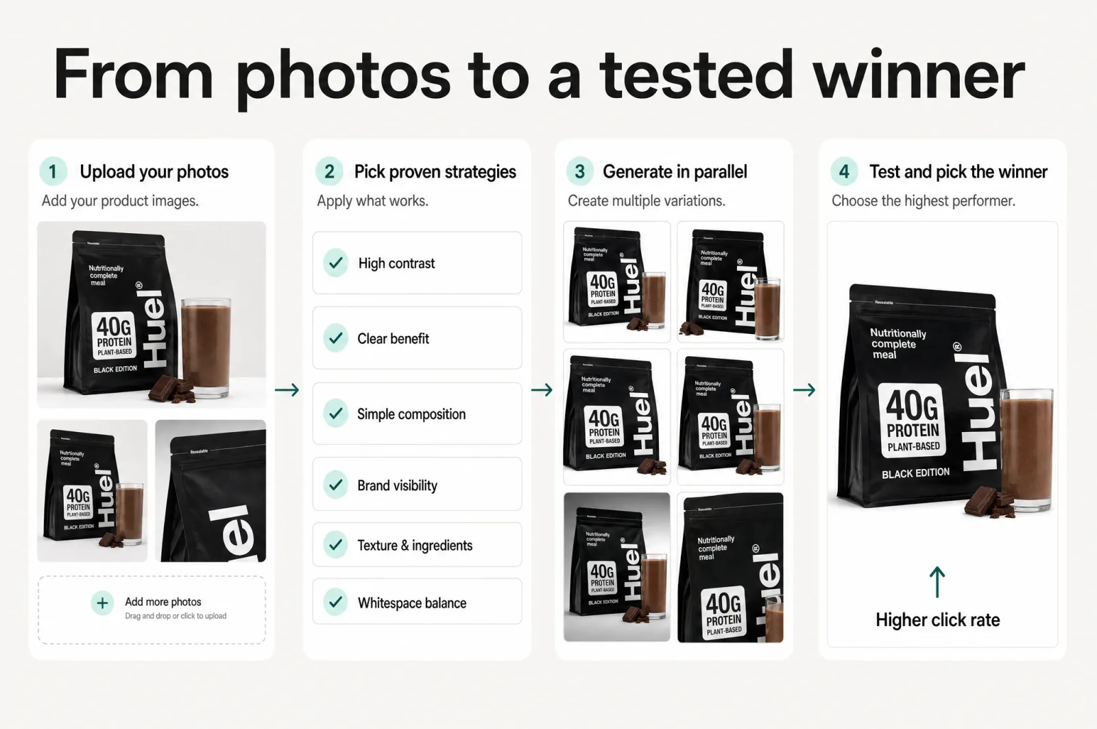
The approach is simple. Generate a handful of distinct, proven concepts. A tighter hero crop. A bundle-in-frame version. A different angle that shows scale. Run them, and let the click decide instead of your gut. This is where volume plus strategy beats one expensive render: not because more images are better, but because testing beats guessing every time.
How to do all of this in minutes
Doing this by hand is slow. You brief a designer, wait days, get one concept, and still do not know if it clicks. This is the job Scalable was built to remove.
In Scalable's main-image hub, you upload a few photos of your product and pick from 21 proven CTR strategies, each built to move the click. They generate in parallel, so you get a portfolio of distinct concepts in minutes instead of one render in days. You do not have to know which strategy is right. Generate several, run them, and let clicks pick the winner. Every strategy carries a compliance flag, showing which stay inside Amazon's product-only rule for the main slot and which belong on your gallery. A max-accessibility mode strips callouts and badges to produce a fully compliant main image on demand.
The difference from a generic image tool is what sits underneath. These concepts are built from your product's real review and competitor data, so they target what drives the click in your category, not a random aesthetic. They come out as real shots of your product, kept on-brand across every SKU, not the off-brand slop a prompt returns. No prompting, no design skill, no waiting on anyone.
Try it on your own listing
Your main image is the cheapest, highest-leverage fix you can make to a listing, and the one most sellers get wrong. You do not need a designer or a lucky guess. You need the right strategies, inside the rules, tested against each other.
Open Scalable's main-image hub, add your product, and generate a portfolio of click-optimized main images in minutes, built on your own data. You can try it free on your own listing and see the concepts before you commit a cent. Pick the one that wins the grid, ship it, and watch the click climb.
Frequently asked questions
- Can you put text on an Amazon main image?
No. Amazon requires the main image to show only the product for sale on a pure white background, with no text, logos, badges, borders, or graphics. Text-based approaches like benefit callouts and trust badges belong on your secondary gallery images, where they are allowed and where they carry the sales pitch. Keep the main image product-only to avoid search suppression.
- What size should an Amazon main image be?
Amazon recommends the longest side be at least 1600px so the listing qualifies for zoom. Use a pure white background and let the product fill at least 85% of the frame. Larger, sharp, zoom-ready images read as more premium in the search grid and on the detail page, which helps both the click and the sale. Correct image size is a baseline, not an edge you can win on.
- How many main images should you test?
Test more than one. Even experienced sellers cannot reliably call the winning image, so the smart play is to generate several proven approaches and let real click data decide. Start with 3 to 5 distinct concepts, run them, and keep the one that lifts click-through. Small differences in the main image compound across every shopper who sees your listing in search.
Sources
- 1.Amazon Seller Central: Product image requirements
- 2.Amazon Seller Central: Technical image file requirements
- 3.Get a full Amazon A+ content stack in minutes, on-brand, in-house
- 4.AI product photography for Amazon: ChatGPT vs Scalable
- 5.Your best Amazon gallery images are hiding in your reviews
- 6.Turn your Amazon reviews into a main image that wins the click
- 7.Stop gambling on your Amazon listing
- 8.Design for the Amazon thumbnail: listing images that still sell on a phone
Built by someone who’s lived it.
I’ve been in e-commerce since 2018. I built and exited my own brand, then spent 5+ years running a creative agency for product companies, shipping the listings, ads, and content that move real sales.
Filed under
Launch your full Amazon listing in minutes, in-house and on-brand
Main image, gallery, A+, ads, translations and variations. Built on your reviews, optimized for conversion.
Next recommended read
Get a full Amazon A+ content stack in minutes, on-brand, in-house
Amazon A+ content used to mean an agency and weeks of waiting. Here's how to produce a full, on-brand A+ stack in-house, in minutes.
6 min read
More on this topic — playbooks and product deep-dives.
AI product photography for Amazon: ChatGPT vs Scalable
AI product photography for Amazon, head to head: where ChatGPT's image model stops and what building a listing that converts takes.
Your best Amazon gallery images are hiding in your reviews
Amazon listing optimization starts in your reviews: a 4-step method to find conversion drivers, close communication gaps, and build gallery images that sell.

Turn your Amazon reviews into a main image that wins the click
Your Amazon reviews already tell you what makes shoppers click. Turn that signal into a high-CTR main image that stays inside Amazon's rules, at catalog scale.