

Jacob Jan Founder, Scalable
Writes about commerce AI and creative operations.
Conversion strategy
Amazon listing optimization: turn 8 images into an ordered sales pitch
One image earns the click. The other 7 answer every reason a shopper hesitates.
TLDR
- You paid for beautiful product photos, and your conversion rate barely moved.
- The problem is not how they look. It is that they are not arranged to sell: one to earn the click, the rest to answer why a shopper hesitates.
- Treat the set as an ordered pitch and you can design each image on purpose, from what your buyers tell you.
- Do it once and it becomes a system you repeat across every product you sell.
Amazon listing optimization: turn 8 images into an ordered sales pitch
You hired the photographer. You approved the retouching. The new pictures look great, and you were sure this was the upgrade your listing needed. Then the conversion numbers came back flat.
It is a familiar, expensive kind of quiet. Most advice on Amazon listing optimization stops at "use high-quality images," as if resolution were the lever. It is not.
A gallery of gorgeous photos can still sell nothing, because looking good and selling well are not the same job.
Here is the reframe. Your images are not decoration. They are the closest thing your product has to a salesperson on the shelf, and right now yours stands there looking handsome and saying almost nothing.
So what makes a listing convert?
Quick answer
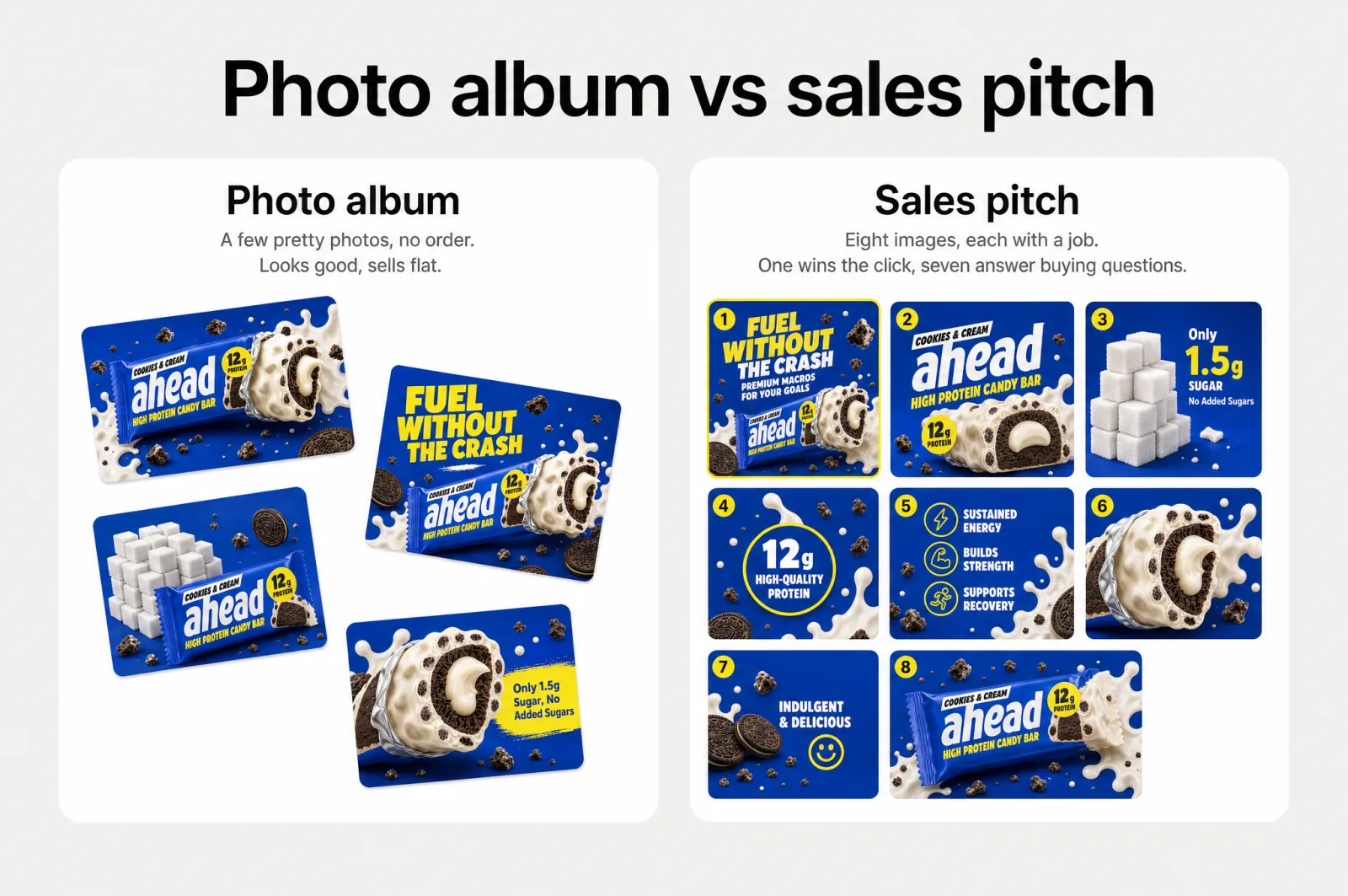
Strong Amazon listing optimization sequences the images like a pitch, not a photo album. One picture, the main image, earns the click in search results. The rest answer the questions a shopper asks before buying, in the order they ask them. Beauty gets attention; the right order gets the sale. And the messages that convert come from your customers' own words, not your taste.
Think about how anyone shops. They do not read your listing. They scan it.
Eyetracking research shows people move through a page in an F-shaped sweep, skimming for anything that matters and skipping the rest [1]. On an average page a visitor takes in only about 20% of the words [2]. Those carefully worded bullets are mostly wallpaper.
The pictures are where the decision happens. When shoppers land on a product page, most of them go straight for the images: one study found 56% start by exploring the images before anything else [3].
So the real question is not whether your Amazon listing images are pretty. It is whether each one does a job.
A photo album has no order and no argument. A sales pitch has both. It opens with a hook, confirms the product is right, shows why it beats the alternatives, defuses the worry that would kill the sale, and closes.
Your images can do the same, in sequence, for every visitor who ever lands on the page. Beautiful images don't convert. Sequenced ones do.
The main image earns one thing: the click
Every picture in your listing has a job, and the first one is the hardest. The main image is the only thing a shopper sees in search results, sitting in a grid next to a dozen rivals.
It cannot explain anything. It has a moment to earn the click that puts everything else you built in front of a buyer.
That makes it the single biggest lever you have. No gallery, however good, is ever seen if the thumbnail loses the grid. And since a shopper's first move is to look at the images [3], the one they meet first in search carries weight out of all proportion to its size.
So give it one job, not five. Pick the single thing that makes a scanning buyer stop: the clearest angle, the most obvious benefit, or the detail that makes your product right for what they typed in the search bar. The main image also has the least room for clutter, and that constraint is a gift, because it forces you to choose.
Everything clever belongs later. The main image is not where you tell the whole story. It is where you win the right to tell it. If you want to go deep on that one picture, that is a craft of its own: how to design an Amazon main image that wins the click.
The other images answer questions the buyer is already asking
Win the click and the job changes. Now the shopper is on your page, interested but unconvinced, running a silent checklist before spending. Your remaining pictures work through that list, one question per image, in the order a buyer thinks.
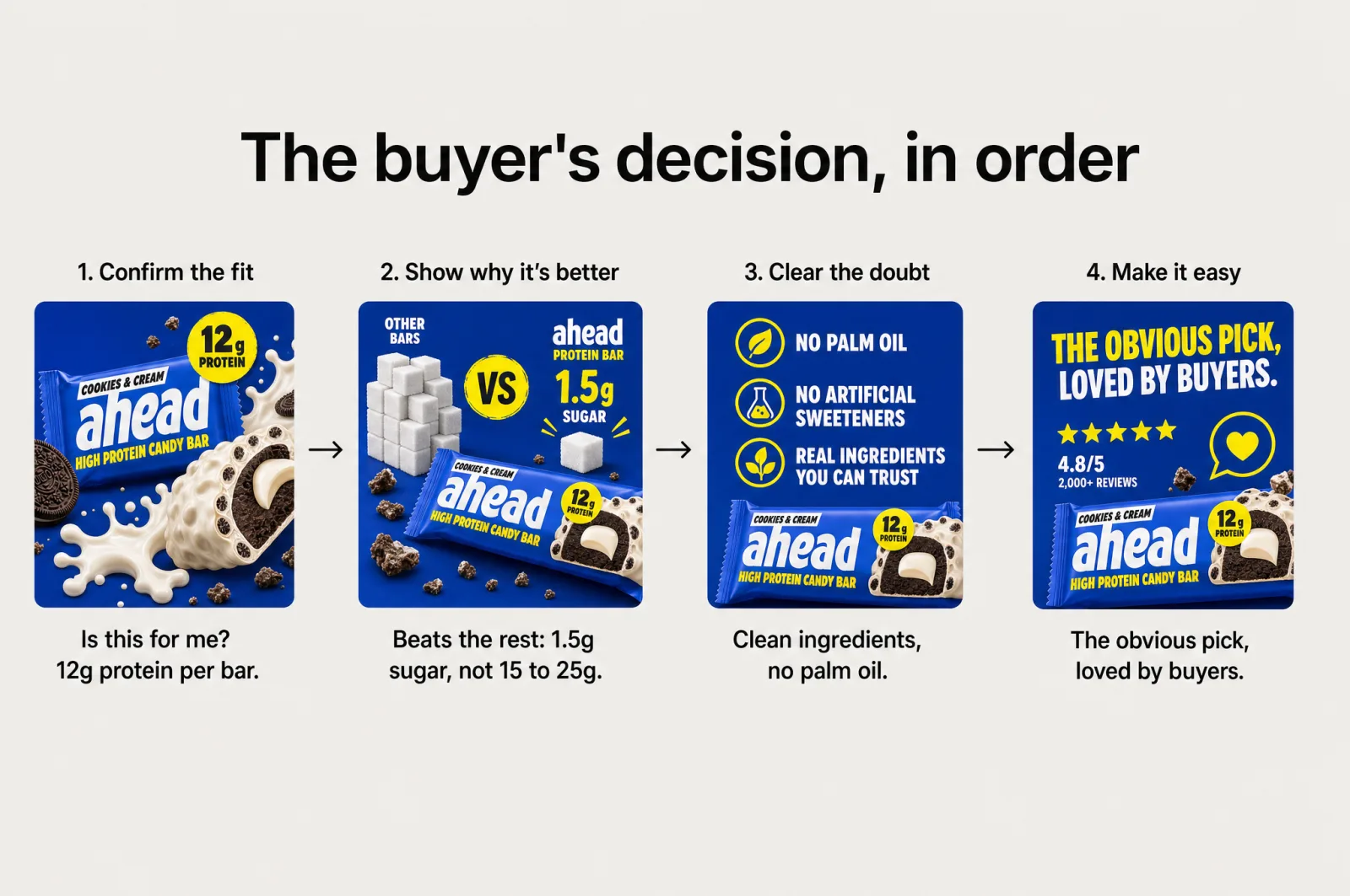
The sequence mirrors a real decision. First, confirm the fit: is this right for what I need? Then differentiate: why is this better than the 3 other tabs open?
Then handle the objection: what am I worried about that would make me leave? Finally, make it easy: show me this is the obvious, low-risk choice.
That arc is not a rigid template. It is the shape of how people talk themselves into buying, and your images either follow it or fight it.
Each of those pictures is a small product infographic: one message, one visual, easy to scan in the moment it gets. That is also why more of them help, as long as each earns its place. Baymard's usability research points to roughly 7 distinct image types buyers want, each answering a different question, before they feel ready to decide [4].
That is the math behind the set: one image to earn the click, seven to answer the questions, 8 in total.
A page with 2 beautiful photos leaves most of the list blank. A page with 7 images that each land one point walks the buyer all the way to "yes." An empty slot is not neutral. It is a question you chose not to answer, and shoppers fill that silence with doubt.
Order matters as much as content. Answer the objection before you confirm the fit and you raise a worry the buyer did not have yet. Lead with a glossy lifestyle shot before you prove the thing works and you decorate a decision you have not earned.
Each image sets up the next, the way a good salesperson does not open with the return policy.
Design the run as a sequence and review it as a sequence, and you catch the pictures that are fine on their own but standing in the wrong place.
How to decide what each image says
So how do you know what each picture should say? You ask 4 questions for every product:
- What must the buyer believe here to keep going? That belief is the message.
- What is their sharpest objection, the one thing most likely to stop the sale?
- What do they misunderstand that a picture could fix in a second?
- What do they already praise, that you should put front and center instead of burying?
Answer those and each answer becomes one image with one message. Not 2. A picture that tries to say 3 things says nothing a scanner catches.
Then arrange the images in the order a buyer decides: confirm the fit, show why it is better, clear the doubt, make the choice easy. The questions find the messages; the arc sets their order.
Make it concrete. Say you sell a cordless handheld vacuum, and walk four of its gallery slots through the questions. Image 1 has to make the buyer believe it is strong enough, so it shows the vacuum lifting real mess with the one number that proves suction, the kPa figure on the box.
Their reviews keep raving about runtime, so image 2 makes the minutes of battery life impossible to miss. Their sharpest worry is that it dies mid-clean, so image 3 shows the charging dock and how little downtime it needs, killing the doubt before it forms. Image 4 makes the whole thing effortless: one hand, one button to empty, a filter that rinses under the tap.
Four pictures, four decisions, one clean line from "maybe" to "add to cart." You did not need a bigger budget. You needed an order.
Notice what those questions did. They moved the design decision off your taste and onto the buyer's own reasoning, which is where it belongs.
Build it from your customers' words, not your opinions
There is a trap hiding in everything above: you, deciding what the buyer cares about. You are the worst-placed person to guess, because you know the product too well and you are quietly in love with the wrong parts of it.
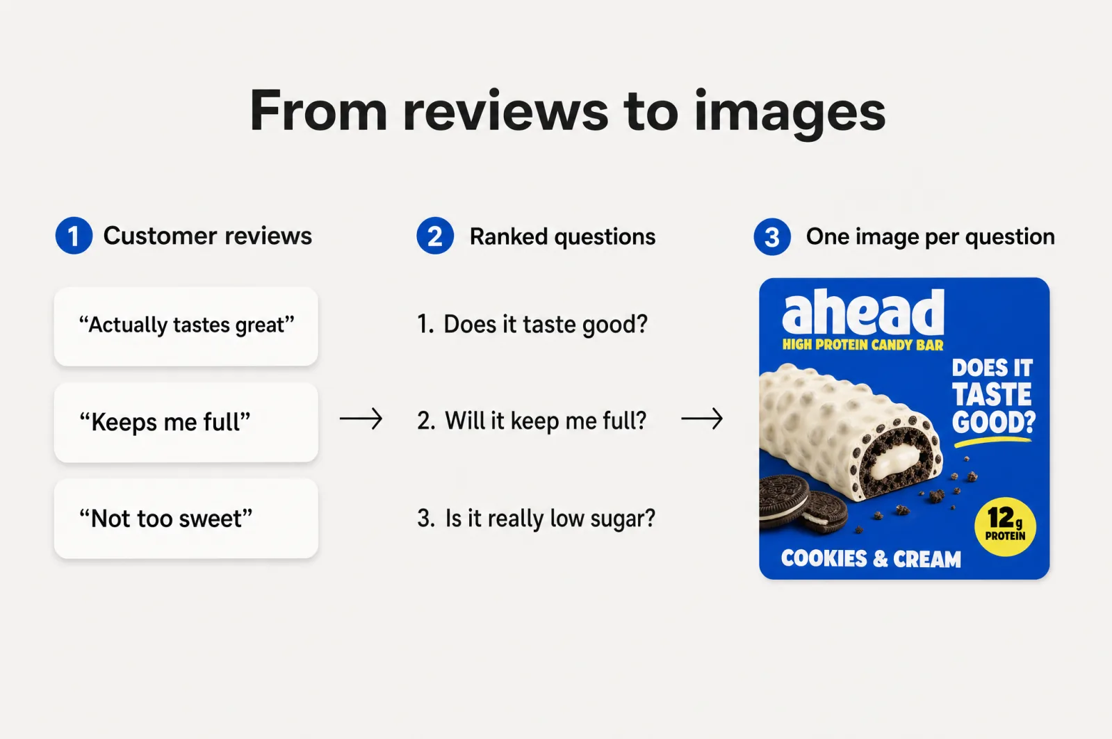
Your customers already wrote the brief. Their reviews, and your competitors', are a running record of what shoppers care about, what they hesitate over, and the words they reach for on both. The one-star entries are the richest, because every complaint is an objection your gallery can answer before it costs you a sale. Read enough and the ranking writes itself: the point raised in half the reviews becomes your first gallery image, not the feature you happen to be proud of.
Competitor reviews are the half most sellers skip, and they pull just as much weight. When buyers complain about a rival, they hand you the objection your product can pre-empt and the exact wording to do it in. When they rave about one, they show you the bar your own images have to clear.
Our own view is that the average e-commerce listing rates about 3.7 out of 10, and this is the cause: not low resolution, but messages picked from the seller's taste instead of the buyer's evidence.
Opinion-led images are a coin flip. Review-led images are a read of the room.
Rank what buyers say by how often they say it, write to the top few, and borrow their language word for word. You stop guessing which picture lands. You start knowing. That is the same instinct behind turning customer reviews into gallery images that convert, applied slot by slot across the set.
Make Amazon listing optimization repeatable across your catalog
One great listing is a nice afternoon. A repeatable method is what changes the business. And everything above is exactly that: a fixed set of slots, a fixed set of questions, and one rule that every message traces back to customer evidence.
This is the part that matters when you run dozens or hundreds of SKUs. A new product stops being a blank canvas and a small creative crisis. It becomes the same 8 decisions, answered from that item's own reviews. Your tenth listing is faster than your first, and your hundredth looks like it came from the same confident brand, because it did.
That consistency answers the objection every scaling owner has: does it stay on-brand across the catalog? Lock your brand look once, apply it to every slot, and the hundredth listing matches the first without a person policing it.
You no longer need to hire a creative team or retain an agency to keep quality even. That is the difference between briefing an agency at four figures a listing and waiting weeks, and running the same quality in-house in minutes.
The slow parts are the research, reading every review and ranking the signal, and the production, building 8 on-brand pictures per product. That is the work a tool should carry so your team does not have to.
Scalable is built for this. It reads your reviews and competitors, turns the signal into a per-product plan, and generates the full on-brand set, so the method runs without a per-listing scramble.
Brands and agencies use it to produce 127k+ assets and roughly 12k products a month, a pace that only works when the approach is a system rather than a fresh guess each time. That is ecommerce conversion optimization run at the level of the whole catalog, not one lucky listing at a time.
Let your own data build your first strategy
You do not need a bigger creative budget. You need to stop treating your images as decoration and start treating them as the ordered pitch they were meant to be. One image to earn the click. The rest to answer, in order, every reason a shopper hesitates. Designed once, repeated across everything you sell.
The best place to start is a product you already have reviews for. Start free, point it at one listing, and let your own customer data build the first strategy, image by image. You keep your workflow, you own the output, and you get to watch the gap close between images that look expensive and images that sell.
Then do it again for the next product, and the one after that, until every listing in your catalog is pitching for you.
Frequently asked questions
- How many images should an Amazon listing have?
Use every image slot your marketplace gives you, and treat the set as one pitch with a single job per image: one main image to earn the click in search, and gallery images that each answer a question a shopper asks before buying. An empty slot is not neutral. It is a buying question you left unanswered, so fill them all.
- What makes a product listing image convert?
Relevance, not beauty. A converting image carries one clear message aimed at a real buying decision: confirming the product fits the need, showing why it beats the alternative, clearing a specific doubt, or making the choice feel easy. The strongest messages come from your own customer reviews, not from an opinion about what looks nice.
- Where do the messages for my listing images come from?
From your customers' own words. Read your reviews and your competitors' reviews to find what buyers repeatedly praise and what they hesitate over. Rank those points by how often they appear, then give each top one its own image, phrased in the language shoppers use. That turns guesswork into a data-backed sequence.
Sources
- 1.F-Shaped Pattern of Reading on the Web (Nielsen Norman Group)
- 2.How Little Do Users Read? (Nielsen Norman Group)
- 3.In-Scale Product Images (Baymard Institute)
- 4.Product Page UX Research (Baymard Institute)
- 5.How to make an Amazon main image that wins the click
- 6.Your best Amazon gallery images are hiding in your reviews
- 7.8 Amazon listing images, 8 jobs: 1 wins the click, 7 win the sale
- 8.How to keep a growing catalog on-brand with a brand kit generator
- 9.Design for the Amazon thumbnail: listing images that still sell on a phone
Built by someone who’s lived it.
I’ve been in e-commerce since 2018. I built and exited my own brand, then spent 5+ years running a creative agency for product companies, shipping the listings, ads, and content that move real sales.
Filed under
Launch your full Amazon listing in minutes, in-house and on-brand
Main image, gallery, A+, ads, translations and variations. Built on your reviews, optimized for conversion.
Next recommended read
How to make an Amazon main image that wins the click
Your Amazon main image decides the click. Learn what moves CTR, what the rules allow, and how to test a portfolio of proven strategies fast.
8 min read
More on this topic — playbooks and product deep-dives.

Your best Amazon gallery images are hiding in your reviews
Amazon listing optimization starts in your reviews: a 4-step method to find conversion drivers, close communication gaps, and build gallery images that sell.

8 Amazon listing images, 8 jobs: 1 wins the click, 7 win the sale
Your Amazon listing is not one hero image. It is 8 Amazon listing images doing 8 jobs: 1 wins the click, 7 win the sale. Here is the blueprint.

How to keep a growing catalog on-brand with a brand kit generator
An inconsistent catalog leaks trust and sales. See how a brand kit generator locks your brand once so every listing stays on-brand as you scale.