

Jacob Jan Founder, Scalable
Writes about commerce AI and creative operations.
Conversion
Turn your Amazon reviews into a main image that wins the click
A repeatable way to read your reviews, find the one angle that earns the click, and ship it without breaking Amazon's rules.
TLDR
- You are scaling a catalog, and every new listing waits on creative that is slow, costly, and never proven before it goes live.
- The main image shoppers see first in search decides whether they click, yet most brands pick it on taste and hope.
- Your customers already wrote down what makes them buy. Read it right, and it points to the exact angle to put front and center.
- Here is the repeatable method to turn that signal into a first impression that converts, at the speed a growing catalog needs.
How do Amazon reviews improve main image click-through rate?
Quick answer
Reviews are the one place shoppers tell you, unprompted, what made them buy or hesitate. Rank those recurring themes and a clear winner usually appears: a top objection or a decision driver most Amazon main images never show. Built around that single idea, the image speaks to what buyers scan for, which is what moves click-through.
Most advice about the Amazon main image comes down to taste. Use a white background. Show the product at an angle. Add a lifestyle shot. Useful, but it treats the single most important asset on your listing like a design exercise.
The better question is not "what looks good." It is "what makes this specific shopper click." Your buyers have already answered it, in your reviews.
Why the main image is your biggest click lever
In Amazon search results, a shopper sees just one photo of your product: the main image. It competes against a full grid of rivals for the same half-second of attention. Win that moment and the shopper opens your page, where the gallery, the price, and the reviews can do their job. Lose it, and none of the rest gets seen.
That makes the main image the highest-leverage pixel you own. A better one lifts click-through across every impression the listing already earns, so the gain compounds on traffic you are not paying extra for.
Now multiply that by a catalog. When you scale from dozens of SKUs to hundreds, "pick a nice photo and hope" stops being a strategy. It is slow, it drifts off-brand from one listing to the next, and it quietly caps click-through on every product at once. The fix is not more taste. It is a repeatable method built on data you already have.
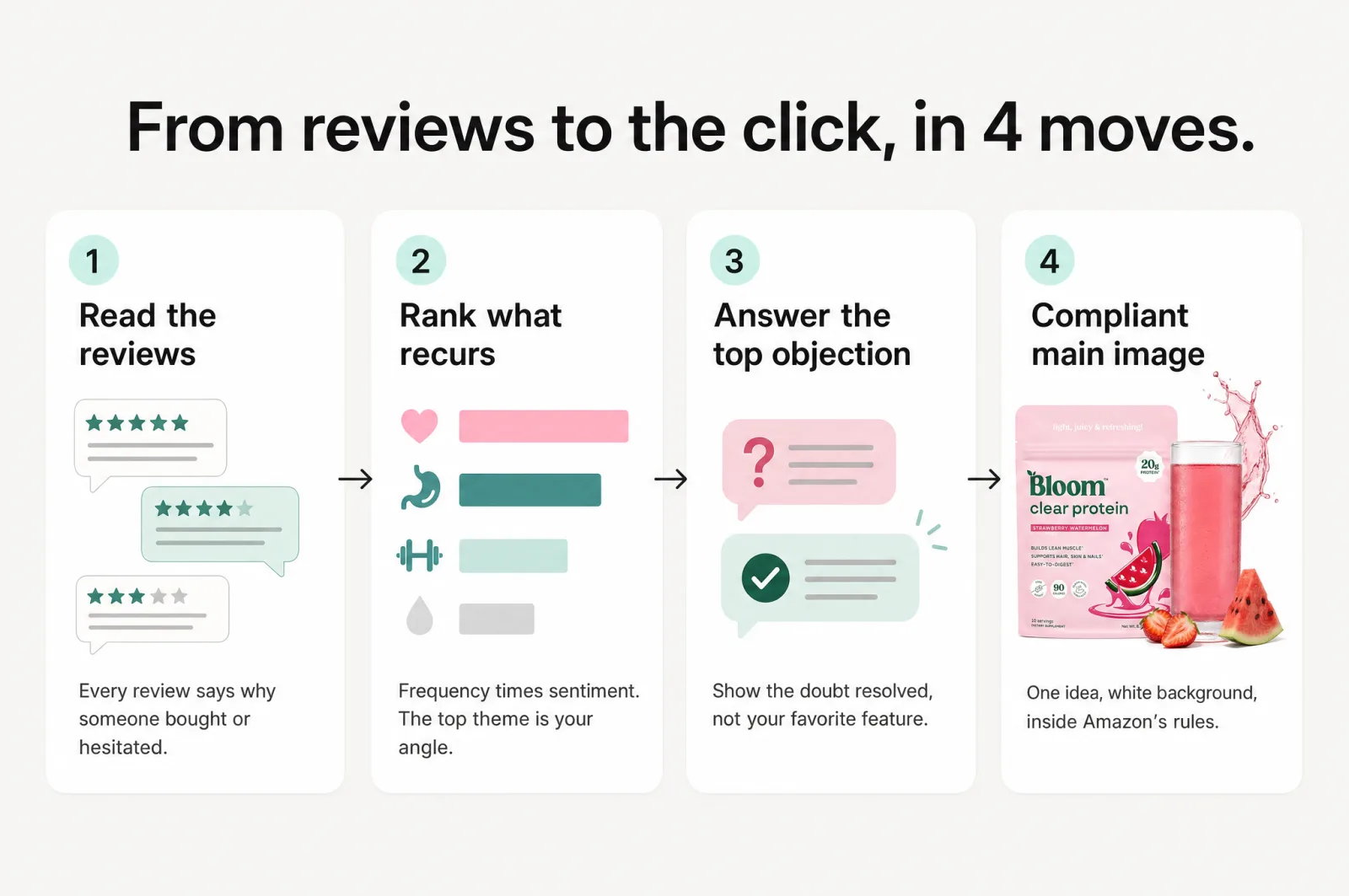
Step 1: Read your reviews for buying signal, not praise
Start with the reviews, but read them for the right thing.
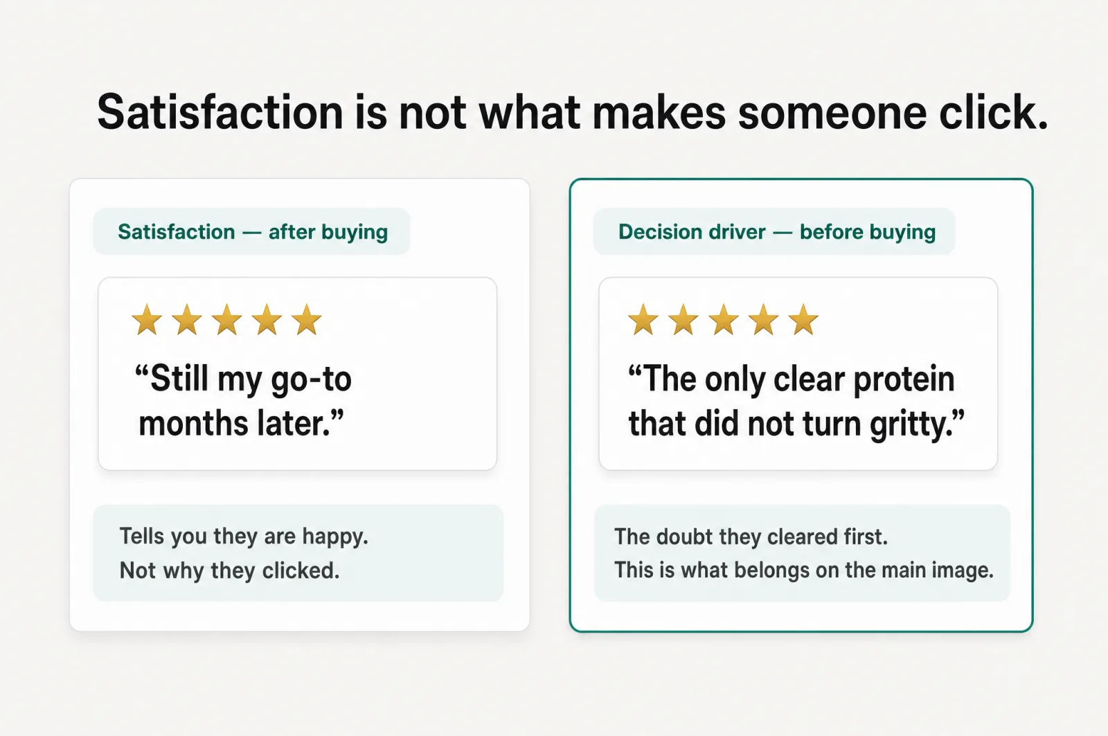
Most people skim reviews for sentiment: are buyers happy or not. That tells you about satisfaction, which is what someone feels after they own the product. It is a different thing from what made them click in the first place. A 5-star review that says "held up great after a year" is lovely, and useless for your main image. Nobody clicked based on a year of ownership they had not had yet.
What you are hunting for is pre-purchase decision drivers: the reasons a shopper chose your product over the one beside it, and the doubts they cleared first. Read for these signals:
- Recurring themes. The point that shows up again and again, not the vivid one-off. Frequency is the vote.
- The words before the purchase. "I was worried it would be too big," "I bought this because it was the only one that fit a standard cabinet." That is buying language.
- Objections that almost stopped them. A doubt raised and then resolved in a review is a doubt thousands of silent non-buyers never got past.
- The exact phrasing. Capture how buyers say it, in their words, not yours. That language is what makes the eventual image feel true.
Doing this by hand across even one product means reading a few hundred reviews and tallying themes on a spreadsheet. It works, and it is exactly the kind of task that never gets done when you have a catalog to run. This is the first step Scalable automates. It reads up to 500 reviews per product and returns the recurring conversion drivers, ranked by how often they come up, their relevance, and their sentiment split, each backed by the real quotes. The manual tally becomes a ranked list you can act on.
Step 2: Find the one angle that stands out
Now turn a wall of signal into a single decision.
Rank your drivers by how often they appear against how strongly buyers feel about them. Mentions times sentiment is a rough but honest score, and the theme at the top is your candidate angle.
Here is where most brands go backwards. The winning angle is usually not your favorite feature. It is the top objection, answered visually. Features are what you are proud of. Objections are what stands between a shopper and the click. Resolve the doubt that recurs most, right there in the image, and you remove friction for every shopper who shared it silently.
There is one more place to look: the gap between what buyers care about and what your current main image shows. If reviews obsess over how compact the product is, and your photo is a straight-on shot that gives no sense of scale, that gap is your opportunity. Close it, and you are answering a question the shopper was already asking.
This is where the analysis earns its keep. Alongside the ranked drivers, Scalable surfaces your communication gaps: the things buyers care about that your listing never shows. It turns "improve your listing" from a vague ambition into a specific, ranked checklist of what to put on screen next.
Step 3: Turn the angle into a main image Amazon will accept
You have your angle. Now it has to become a picture that both earns the click and survives Amazon's rules, because a brilliant main image that gets rejected converts nobody.
Keep two principles in mind.
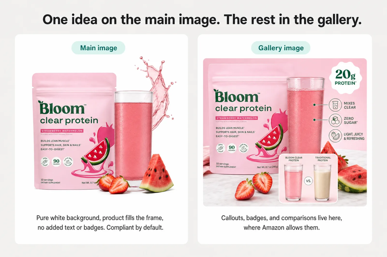
One image, one idea. The main image is not the place to say 5 things. Take the single winning angle from Step 2 and build the whole composition to land it in the half-second you get. Extra ideas dilute the one that matters.
Stay inside Amazon's rules. The main image has strict requirements: a pure white background (RGB 255, 255, 255), the product filling 85 to 100% of the frame, and no text, graphics, logos, watermarks, or promotional messaging [1]. This trips up sellers who try to cram a benefit callout onto the shot. The move is to express your angle through the product and the composition, then push explicit callouts, badges, and comparison text into your gallery images, where they are allowed.
Watch out
Assume the check is automatic. Amazon runs computer vision on images at massive scale. Its own vision service is documented as analyzing billions of images and videos daily, including detecting text inside images [2]. The practical read for a seller: text baked into a main image can be read by a machine the moment you upload, so "it looked fine to me" is not the bar. Keep the frame clean by default.
This is the step where a tool built for Amazon earns its place. Scalable generates the main image against 21 proven click-through strategies and flags the compliance level of each, including a max-accessibility mode that strips callouts and badges for a clean shot. Every product is generated with Amazon's terms of service applied by default, so the output comes out built inside those rules rather than audited against them afterward. That reduces the risk of a suppressed listing, instead of leaving you to catch problems by hand.
Don't ship one guess: build a portfolio and let clicks decide
Here is the honest part no method can skip: you do not know which angle wins until real shoppers vote with their clicks.
So do not bet the listing on a single image. Produce several compliant versions of your strongest angles, put your best one live, then A/B test the alternatives against it and let click-through rate settle the argument. Keep the winner, and iterate on the next SKU.
Testing at all is where "improve the main image" usually dies, because generating five real options by hand is a project. When each variant is a few clicks instead of a design brief, testing becomes something you do. That is the difference between one opinion and a decision backed by data.
How Scalable runs the whole method in minutes
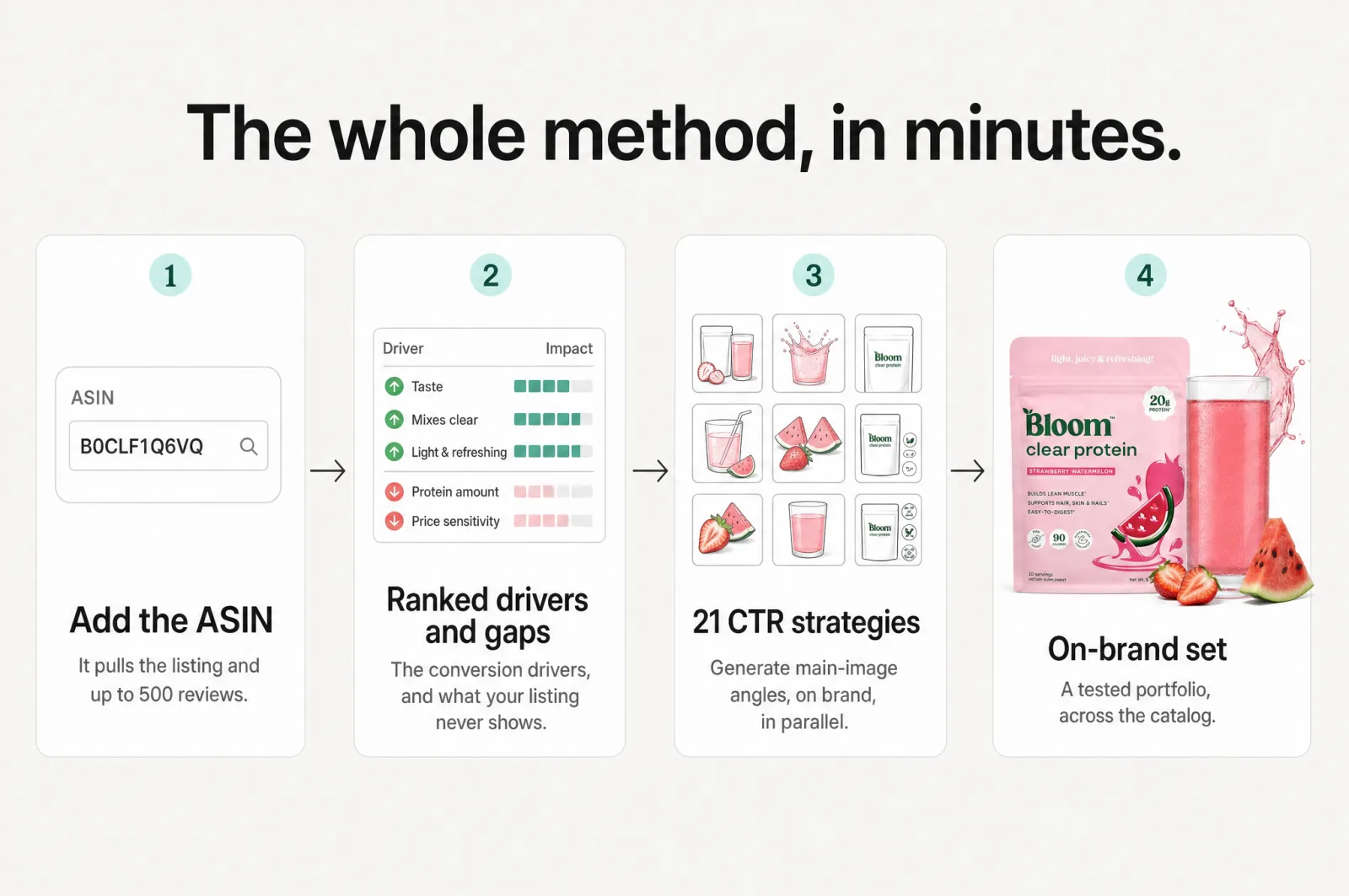
Read the three steps back and they describe one workflow: analyze the reviews, find the angle, produce a compliant image, test. Scalable is that workflow, collapsed into minutes.
Add a product with its ASIN, and it pulls the listing and reviews, ranks the conversion drivers, and flags the communication gaps. From there you generate main image options against the 21 click-through strategies, on brand, because your brand kit locks color, type, and style so the output stays consistent across the whole catalog. It turns product photography from a per-listing guessing game into a data-backed workflow. What took a week of review-reading, briefing, and back-and-forth becomes a set of options in minutes.
A team or an agency can produce a nice image. What they cannot do cheaply is close that review-to-angle loop on every SKU, every time, and keep it on brand across a growing catalog. Agencies run $1k+ per listing and take weeks. In-house creative runs $5k+ a month and is hard to staff. For a growing brand, bringing the same work in-house, in minutes, at a fraction of that, is the leverage. You keep control of the outcome without hiring a creative team or signing another retainer. Brands and agencies generate more than 127k assets a month on Scalable this way, across 7,500+ brands and agencies, all built on their own data, not prompts.
Start with one product
Pick your worst-performing listing, the one where you suspect the main image is leaving clicks on the table. Add it to Scalable, read what your own reviews say is driving the decision, and generate a main image built around that angle, inside Amazon's rules.
You can do it free, on one product, in the time it would take to brief an agency on a single listing. See your reviews become a click-tuned first impression, then decide.
Your customers already told you what makes them click. It is sitting in your reviews. Go read it, and put it where every shopper sees it first.
Frequently asked questions
- How do Amazon reviews improve main image click-through rate?
Reviews are the only place shoppers tell you, unprompted, what made them buy or hesitate. Rank the recurring themes and one usually outweighs the rest: a top objection or a decision driver most listings never show. Building your main image around that single idea speaks to what buyers scan for, which is what lifts click-through.
- Can you put text or badges on your Amazon main image?
No. Amazon's product image rules require a pure white background and prohibit text, graphics, logos, watermarks, and promotional messaging on the main image. Keep the main image clean and compliant, and move callouts, badges, and comparison text into your gallery images where they are allowed.
- What makes a good Amazon main image?
A pure white background, the product filling most of the frame, and one clear idea. The strongest idea is not your favorite feature. It is the thing your reviews show buyers care about most, shown visually so a shopper understands it in the split second the search results give you.
Sources
Built by someone who’s lived it.
I’ve been in e-commerce since 2018. I built and exited my own brand, then spent 5+ years running a creative agency for product companies, shipping the listings, ads, and content that move real sales.
Filed under
Launch your full Amazon listing in minutes, in-house and on-brand
Main image, gallery, A+, ads, translations and variations. Built on your reviews, optimized for conversion.
Next recommended read
Amazon main image requirements: stay compliant and still win the click
The Amazon main image requirements in full, plus how to lift click-through without breaking a rule or getting your listing suppressed.
8 min read
More on this topic — playbooks and product deep-dives.

How to make an Amazon main image that wins the click
Your Amazon main image decides the click. Learn what moves CTR, what the rules allow, and how to test a portfolio of proven strategies fast.
Your best Amazon gallery images are hiding in your reviews
Amazon listing optimization starts in your reviews: a 4-step method to find conversion drivers, close communication gaps, and build gallery images that sell.
Design for the Amazon thumbnail: listing images that still sell on a phone
Most shoppers meet your listing as a tiny Amazon thumbnail on a phone. 5 rules for listing images that stay legible and sell at small size.